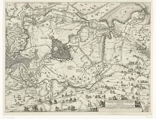
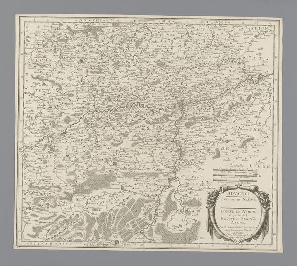
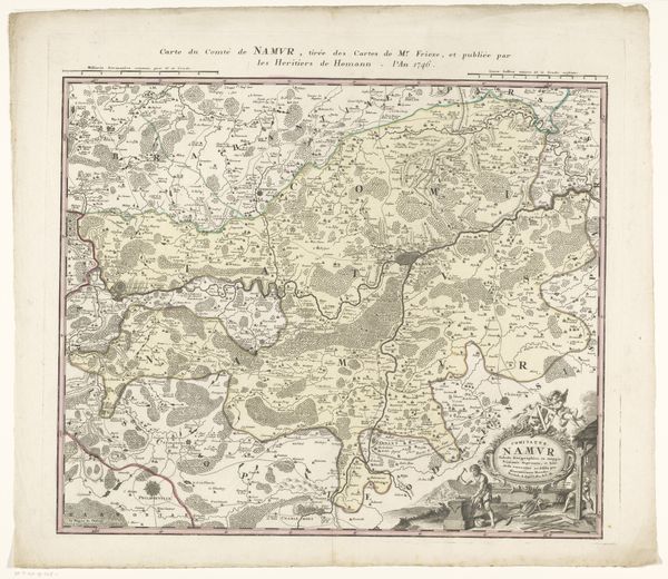
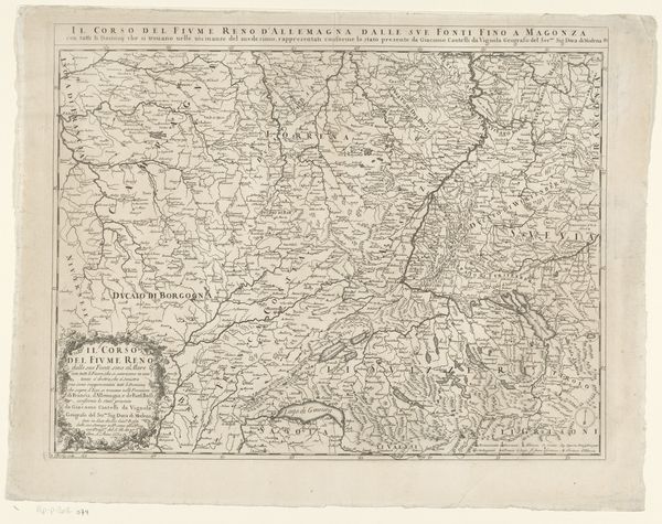
Kaart van het graafschap Namen met de posities van de Geallieerde en Franse legers, 1692 1692 - 1720
anonymous
Rijksmuseum
drawing, print, ink, engraving
pen and ink
drawing
baroque
old engraving style
landscape
ink line art
linework heavy
ink
pen work
engraving
Dimensions: height 475 mm, width 613 mm
Copyright: Rijks Museum: Open Domain
Editor: Here we have "Kaart van het graafschap Namen met de posities van de Geallieerde en Franse legers, 1692", a map created between 1692 and 1720 by an anonymous artist. It’s a print made with pen and ink, and engraving techniques. I’m struck by the level of detail, it’s quite intricate, and dense with information, yet somehow maintains a stark, almost desolate mood. What can you tell me about the symbolism embedded in such a cartographic image? Curator: Indeed! This isn't merely a geographical record; it's a symbolic representation of power, conflict, and territorial ambition. Consider how the detailed rendering of military positions transforms the landscape into a stage for geopolitical drama. What emotions are conjured by the meticulous depiction of opposing forces? Editor: Well, there is a sense of impending conflict, or perhaps controlled tension? It’s interesting how something seemingly objective can still evoke such a feeling. Is the map itself intended to influence perceptions? Curator: Precisely. Maps have long served as tools to shape understanding and justify actions. In this period, maps weren't neutral; they declared ownership, asserted dominance, and influenced public opinion. Think about the symbols used for fortifications, the delineation of borders – how might those visual choices reflect contemporary political narratives? Editor: So, the placement and style of these elements aren't arbitrary then, each carries a specific meaning or perhaps a bias? Curator: Absolutely. And the absence of certain details can be as telling as what's included. Reflect on the artistic style—the Baroque period. Does this style choice influence how the information is received? What visual cues link it to Baroque aesthetics beyond just the date? Editor: Now I’m noticing the almost theatrical quality of the presentation…the heavy linework gives it a dramatic flair, a sense of importance that a simpler map might lack. I’ve definitely learned to see this as more than just directions. Curator: Precisely. Hopefully you leave with more than just directions.
Comments
No comments
Be the first to comment and join the conversation on the ultimate creative platform.