graphic-art, print, paper, watercolor, ink
#
portrait
#
graphic-art
#
art-nouveau
# print
#
landscape
#
paper
#
watercolor
#
ink
#
orientalism
#
cityscape
Copyright: Public domain
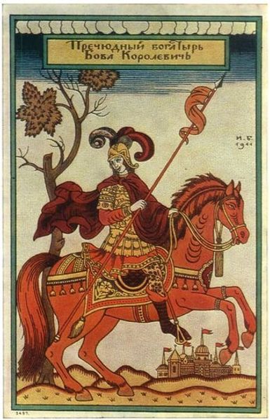
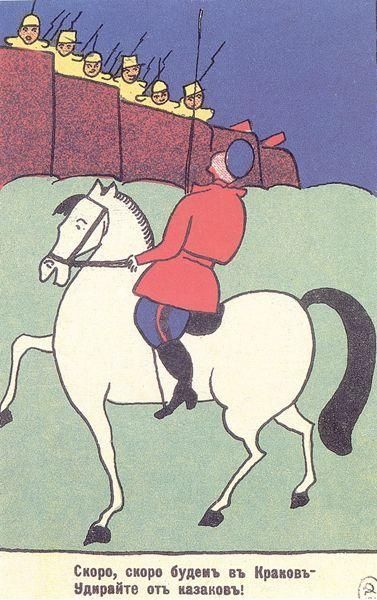
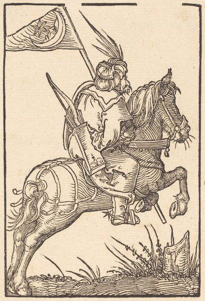
This alphabet print, 'K' for Kozak, by Heorhiy Narbut, feels like a page out of a fairytale, even though it was probably made with lithography. The colors are so flat and dreamy, like a memory. It's cool how Narbut uses this limited palette to build up different textures and patterns. Look at the horse’s tail, how it clumps into these almost cartoonish curls. They don't look real, but they have their own kind of visual logic. It's like Narbut is saying, "I'm not trying to trick you into thinking this is real life, but I am going to make something that feels alive in its own way." This tail feels as potent as a brushstroke in any abstract painting! Thinking about contemporary artists, someone like Chris Ofili comes to mind. Both are masters of flattening and layering to create these rich, symbolic worlds. It's all about seeing the familiar in new ways.
Comments
No comments
Be the first to comment and join the conversation on the ultimate creative platform.
More like this