print, acrylic-paint
#
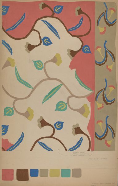
art-deco
# print
#
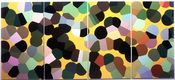
acrylic-paint
#
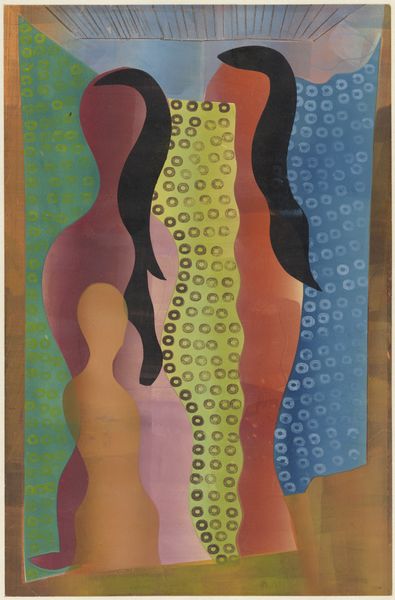
abstract
#
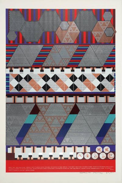
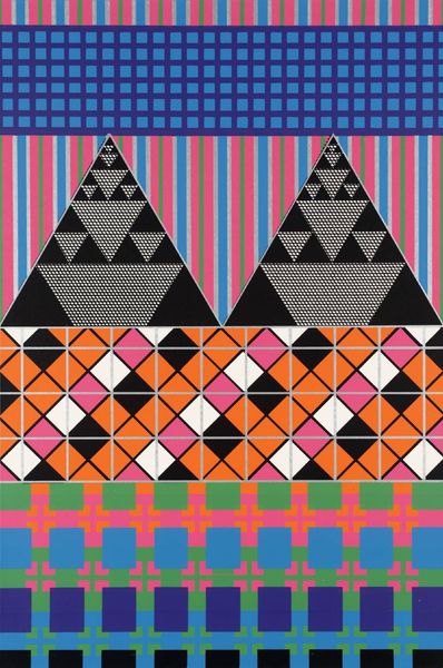
geometric
#
abstraction
#
decorative-art
Copyright: Public Domain: Artvee
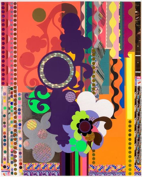
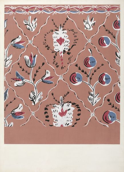
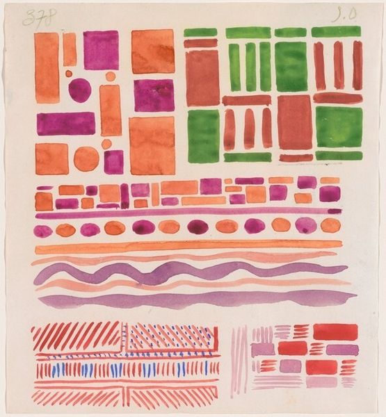
This is Collection decors et couleurs Pl.20 by Georges Valmier, and it feels like it was made with gouache or maybe even screen printing - something that gives you those flat, opaque colors. It's all about shapes bumping up against each other. It's almost like a visual game. The shapes are neat and geometric, but how they come together, that's where the party is! Take, for instance, the main panel. The circles with dots inside and the little angular shapes, they create this rhythm. It's a structured playfulness, like a jazz composition. I love how the colors aren't trying to be realistic; they're just there to make each other pop. It puts me in mind of some of the Bauhaus textile designs. But what Valmier brings to the table is his own sense of quirky playfulness, something that elevates the design beyond mere decoration. In the end, it's this sense of joy that lingers, reminding us that art is always a conversation, a dialogue of ideas across generations.
Comments
No comments
Be the first to comment and join the conversation on the ultimate creative platform.
More like this