About this artwork
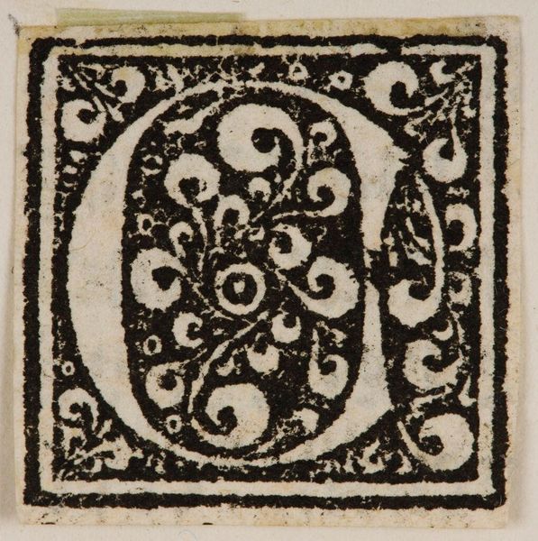
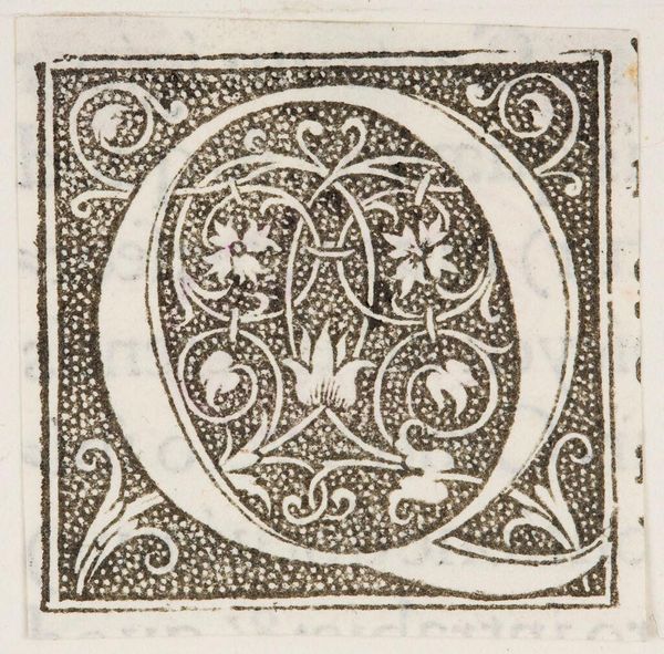
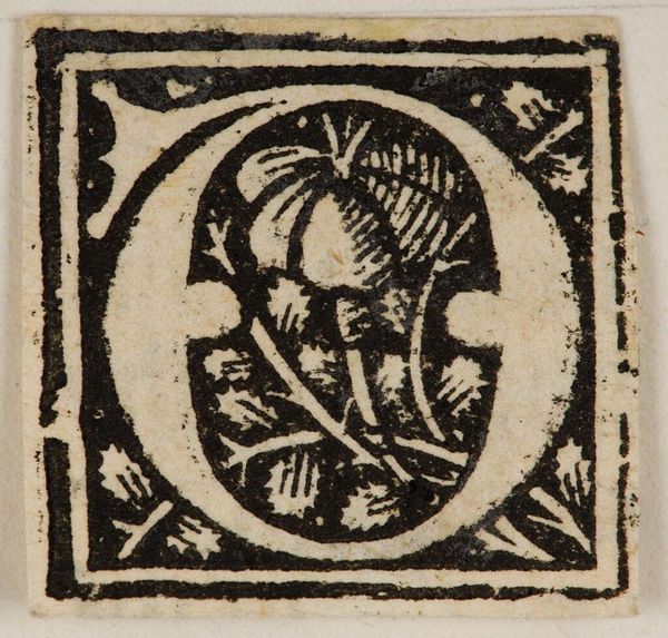
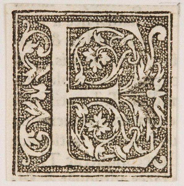
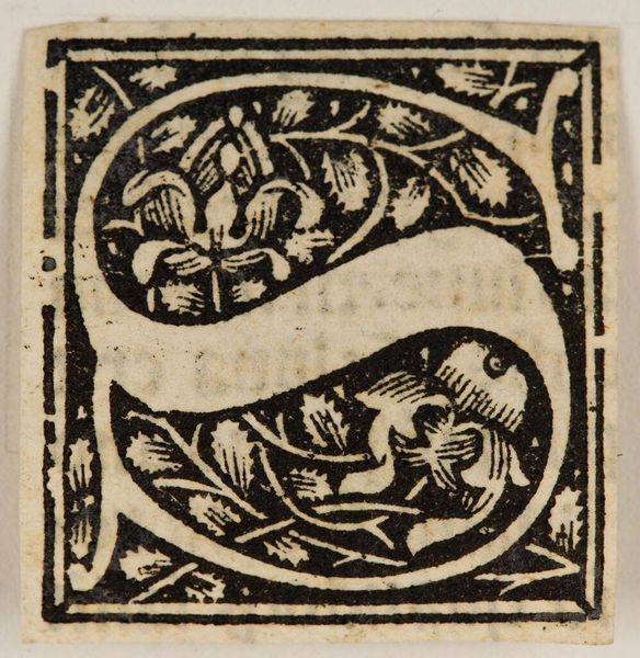
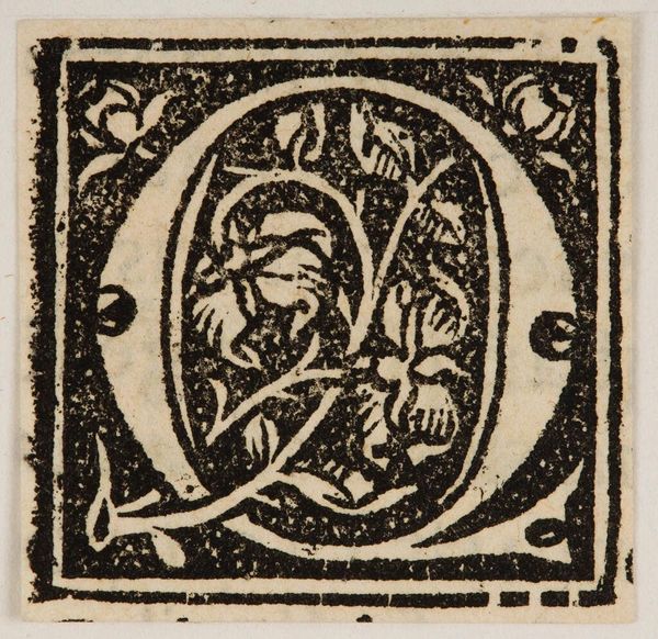
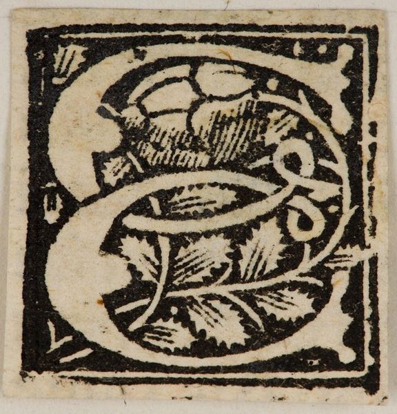
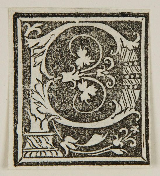
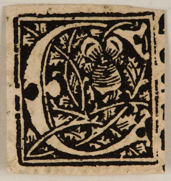
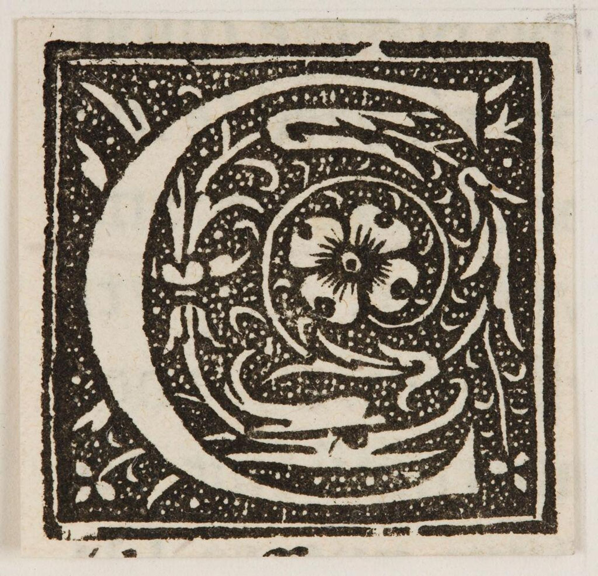
Curator: It's striking how the black ink defines the curves and edges within this illuminated "Letter C," part of the Harvard Art Museums' collection. Editor: Indeed, I'm immediately drawn to the tension between the dense black ink and the untouched white of the paper. It feels almost claustrophobic. Curator: Consider the social function, though. These decorated letters were reproduced for wider consumption, making literacy and art accessible to a burgeoning readership. Editor: Still, the floral motifs—are they idealized forms, or mere decorative filler? It's hard to discern any deeper symbolic meaning. Curator: Perhaps the point is less symbolism and more about the process: how many hands were involved in its creation and dissemination? Editor: Good point. The sheer contrast alone offers a stark elegance, an almost brutal simplicity. Curator: It's a testament to the power of accessible art and design, I think. Editor: Yes, and the formal reduction allows the viewer to appreciate its compositional balance.
Artwork details
- Location
- Harvard Art Museums
- Copyright
- CC0 1.0
Comments
Be the first to share your thoughts about this work.
About this artwork
Curator: It's striking how the black ink defines the curves and edges within this illuminated "Letter C," part of the Harvard Art Museums' collection. Editor: Indeed, I'm immediately drawn to the tension between the dense black ink and the untouched white of the paper. It feels almost claustrophobic. Curator: Consider the social function, though. These decorated letters were reproduced for wider consumption, making literacy and art accessible to a burgeoning readership. Editor: Still, the floral motifs—are they idealized forms, or mere decorative filler? It's hard to discern any deeper symbolic meaning. Curator: Perhaps the point is less symbolism and more about the process: how many hands were involved in its creation and dissemination? Editor: Good point. The sheer contrast alone offers a stark elegance, an almost brutal simplicity. Curator: It's a testament to the power of accessible art and design, I think. Editor: Yes, and the formal reduction allows the viewer to appreciate its compositional balance.
Comments
Be the first to share your thoughts about this work.
