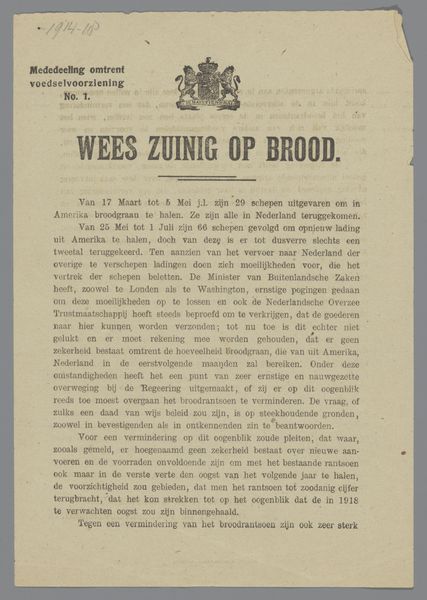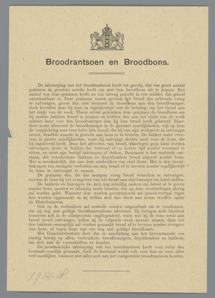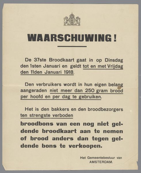
1914 - 1918
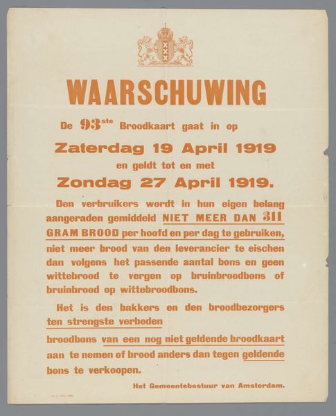
Pamflet met wapen van Amsterdam
De Avondpost
@deavondpostLocation
RijksmuseumListen to curator's interpretation
Curatorial notes
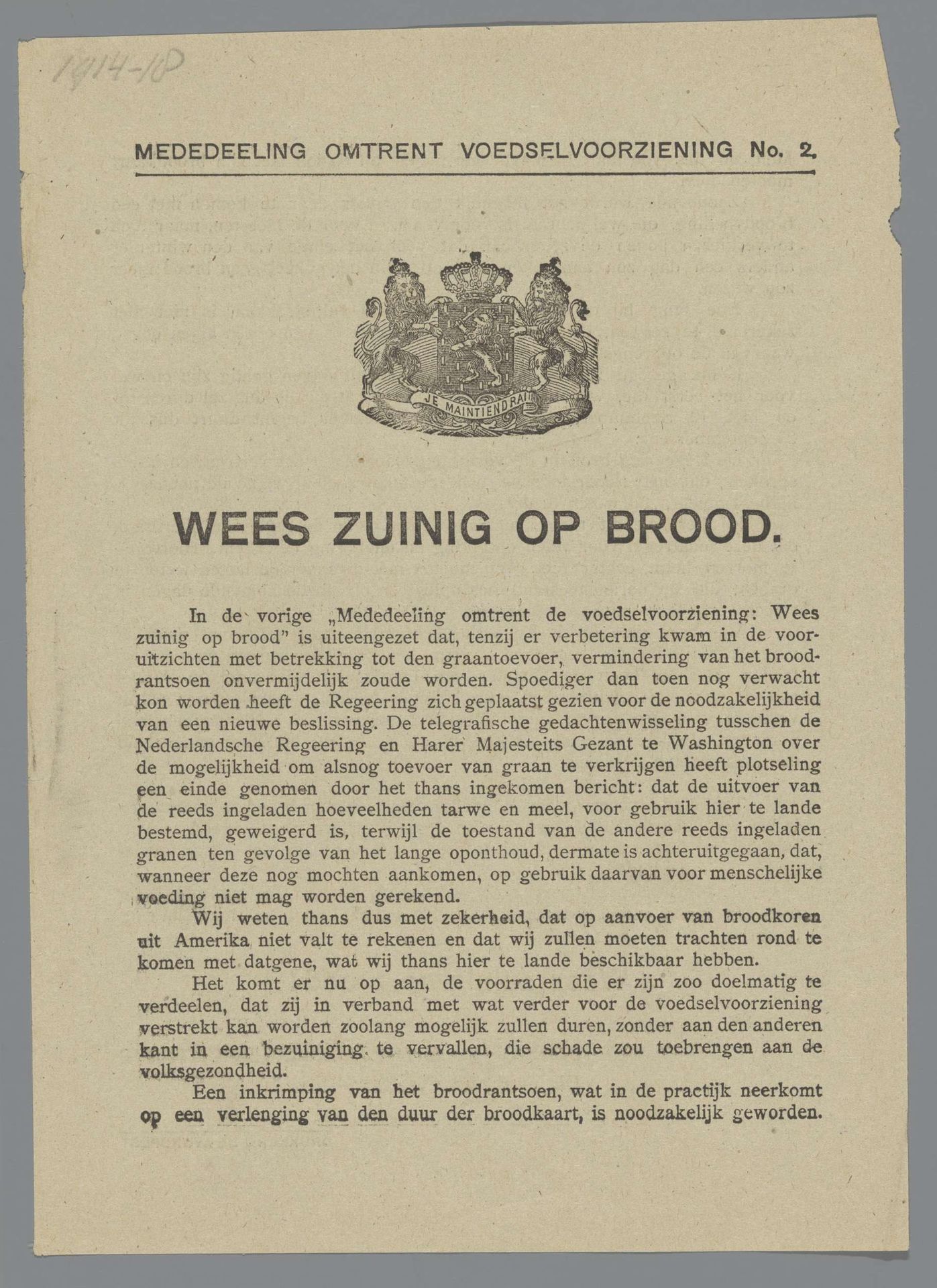
This is a pamphlet created by De Avondpost, and it's a document that speaks volumes about a specific moment in time, printed with what looks like pretty basic equipment. The texture of the paper, slightly aged, gives it away. You can almost feel the ink slightly raised on the surface, a testament to the printing process. The monochromatic palette focuses your attention. The crest at the top feels very formal, but the layout of the type is casual and blocky. I imagine it was laid out very quickly. The text, with its urgent plea, "Be thrifty with bread," it really drives home the desperation and the pragmatism of wartime. It's like a stark reminder that even the most basic things can become precious. It has the same attitude as Barbara Kruger, or Jenny Holzer. What do we need? Now? How can we get it? Looking at this pamphlet, I'm reminded of the power of simple materials to convey complex messages, and the role of art as a historical marker, capturing the essence of human experience in times of both struggle and resilience.