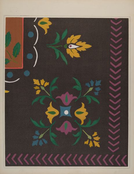
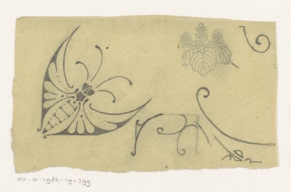
# print
#
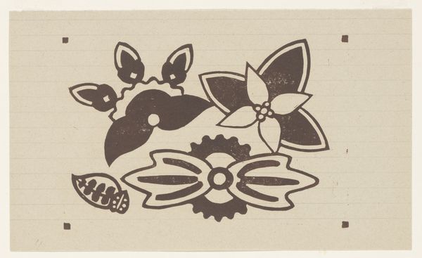
linocut print
#
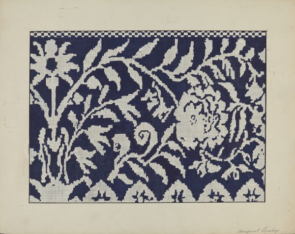
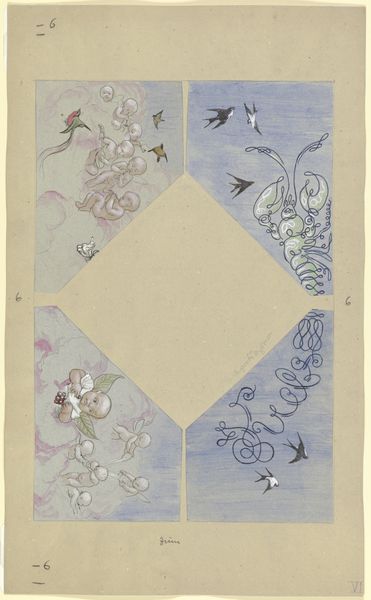
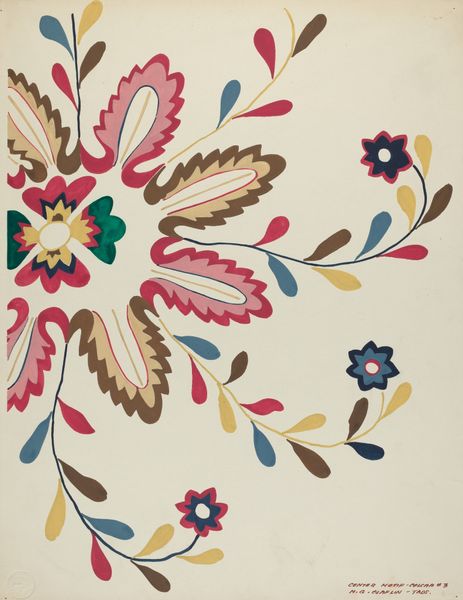
watercolour illustration
Dimensions: height 126 mm, width 209 mm
Copyright: Rijks Museum: Open Domain
Editor: This is "Bloemmotieven," floral motifs, made before 1942 by Reijer Stolk, using printmaking. The contrasting colors and patterns give it a calm and somewhat retro feel. What do you see in this piece? Curator: Initially, one observes a deliberate arrangement of form and color. The composition's strength resides not merely in the representation of flora, but in how Stolk uses the print medium, likely a linocut, to explore visual rhythm. Notice the limited palette: the interaction of blue, brown, and white creates visual harmony. What effect do you believe these chromatic choices have on the overall structure? Editor: It makes the shapes stand out while keeping the feel consistent throughout the entire piece. I see some tiny square shapes repeated along the edges, are these intentional? Curator: Quite right. These squares serve as more than just decorative elements; they provide a structured framework to the organic floral forms. Through this interplay, we begin to discern how Stolk employed structure to give the artwork its depth, even within a seemingly simple arrangement. Would you agree? Editor: I agree! Now I’m thinking about how he achieved that level of detail and balance using printmaking. Curator: Precisely! Thinking about the choices in production gives us more insight on its formal structure and inherent properties. What a worthwhile endeavour.
Comments
No comments
Be the first to comment and join the conversation on the ultimate creative platform.
More like this