photography, albumen-print
#
portrait
#
archive photography
#
photography
#
historical photography
#
albumen-print
Dimensions: height 102 mm, width 62 mm
Copyright: Rijks Museum: Open Domain
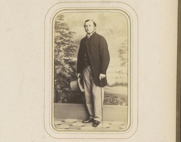
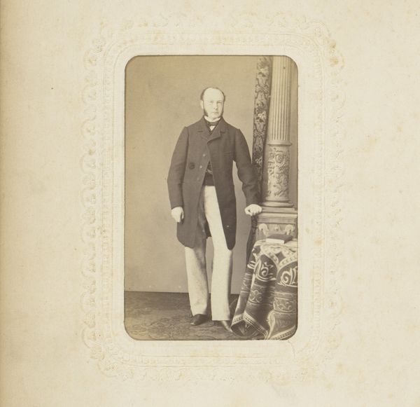
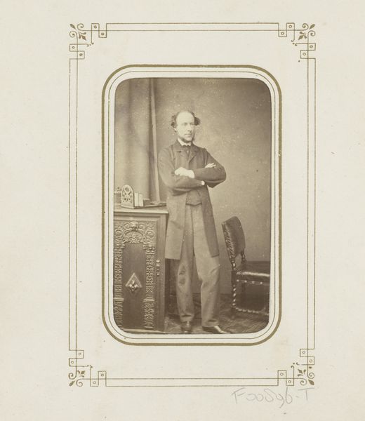
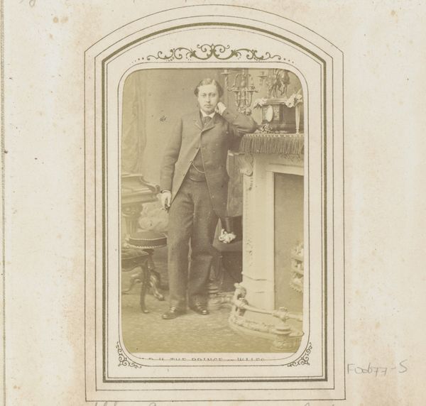
Curator: "Portret van een staande man, leunend op een boekenkast," or "Portrait of a Standing Man Leaning on a Bookcase," an albumen print created by the London Stereoscopic Company sometime between 1862 and 1890. What do you see when you first look at it? Editor: Pompousness! Utter and delightful pomposity. He practically reeks of self-satisfaction. I imagine he's just finished a particularly eloquent lecture on the classics, or perhaps a brilliantly cutting remark about a rival. Curator: Indeed, his pose suggests a certain confidence. His stance, leaning casually against the bookcase, feels very deliberate, a construction, perhaps, of his public persona. And what about the bookcase itself, teeming with texts – is it really about erudition or a mere prop for demonstrating access to knowledge? Editor: Both, I think. It's that delicious dance between genuine interest and performative intellectualism. The bookcase is a symbol, of course, but I wonder what’s actually *in* it. Are we talking philosophy, poetry, or maybe just very impressive-looking leather-bound encyclopedias? His smugness hints at a bit of a faker, don't you think? A grand illusion of knowledge... Curator: Perhaps, and his attire further complicates this reading: an intentionally mismatched color scheme, holding glasses – but are they for show, merely affecting a certain intelligence and attention to detail? These visual cues form a constellation that we then interpret. How does the photography itself help with this? Editor: I imagine the constraints of photography at the time played a part. This calculated pose seems more necessary, an antidote to longer exposure times which would necessitate frozen postures. The sepia tones give it this wonderfully antique feel – as if we’re peering into a long-gone era of high collars and even higher opinions. A snapshot from time, now a study of power. Curator: Indeed. The nuances captured in the shadows and textures of the image transform what could be merely a standard portrait into an examination of self-presentation and, possibly, even the construction of historical memory. The choice of props elevates this above what one might typically associate with carte de visite. Editor: Ultimately, it feels deeply human. Flawed, of course, and wonderfully silly. A reminder that even behind the most carefully curated facade, there's always a bit of that familiar yearning for respect.
Comments
No comments
Be the first to comment and join the conversation on the ultimate creative platform.
More like this