Copyright: Modern Artists: Artvee
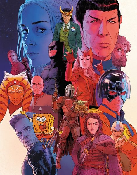
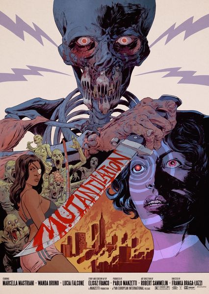
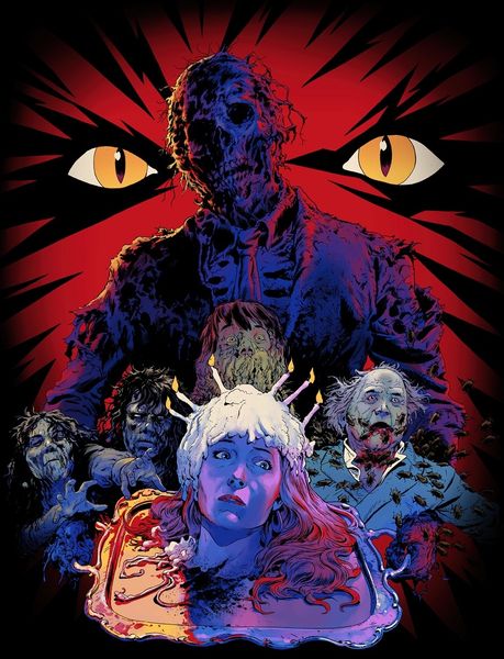
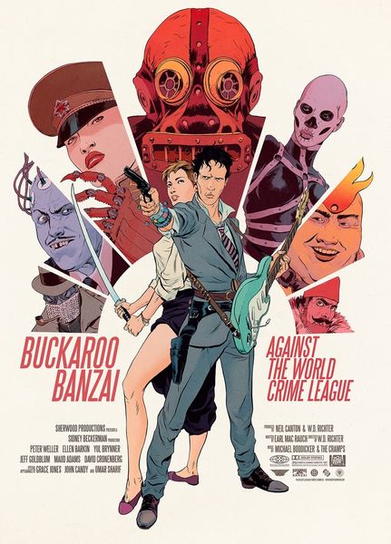
Robert Sammelin made this illustration for Entertainment Weekly using digital tools. It's got that graphic novel feel, all sharp lines and bold blocks of color. The palette is really something, right? This unreal mix of blues and pinks, it's like a horror movie dream sequence. I love how the artist isn't afraid to use flat color, no fussy blending here! It makes the whole thing pop, gives it this cool, otherworldly vibe. Take a look at the texture he creates with the shading, especially on the mummies in the background. He uses these simple cross-hatching marks to give the impression of decaying bandages, it's so effective! It reminds me a little of early punk flyers and record covers, all about getting the message across with minimal fuss, and letting the energy of the image speak for itself. It’s this great balance of graphic design and painterly mark-making. It makes me think about how artists like Lari Pittman also play with these contrasting flat and textured areas. Both using a limited palette to suggest depth and atmosphere. Like the work of Lari Pittman, Sammelin’s art has a very contemporary graphic feel!
Comments
No comments
Be the first to comment and join the conversation on the ultimate creative platform.
More like this