drawing, print, paper, typography
#
drawing
#
aged paper
#
homemade paper
#
script typography
# print
#
book
#
arts-&-crafts-movement
#
hand drawn type
#
personal journal design
#
paper
#
personal sketchbook
#
typography
#
hand-drawn typeface
#
fading type
#
sketchbook drawing
#
sketchbook art
Dimensions: height 195 mm, width 130 mm
Copyright: Rijks Museum: Open Domain
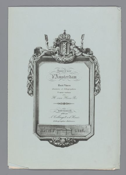
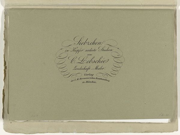
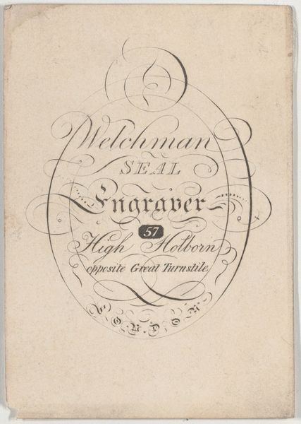
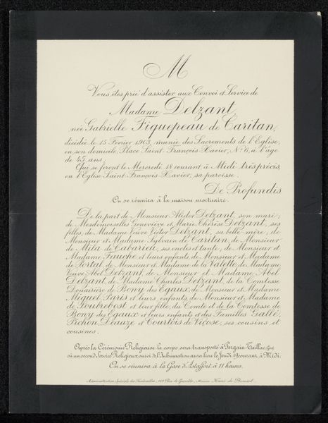
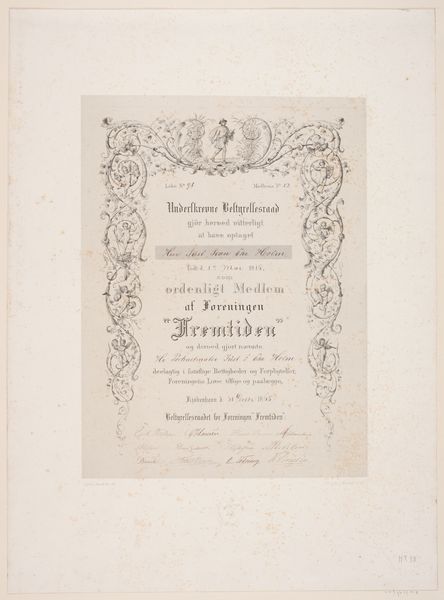
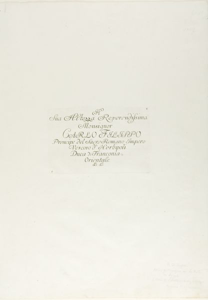
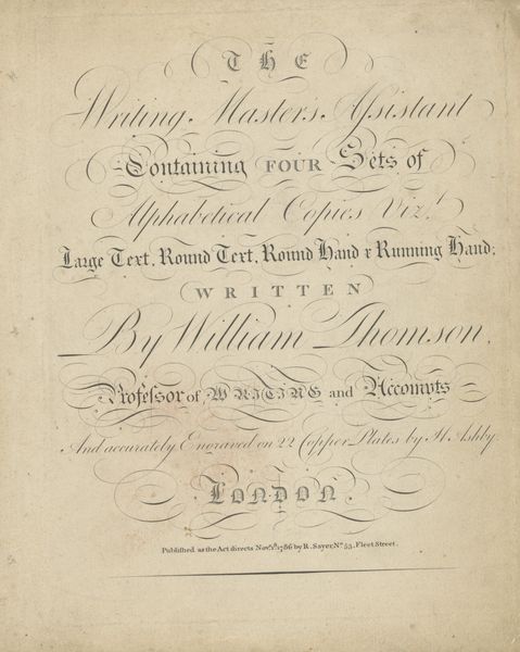
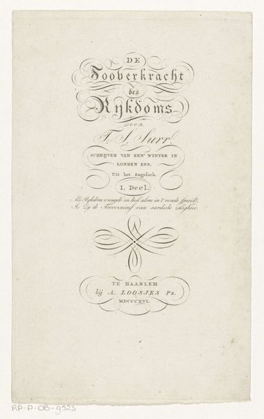
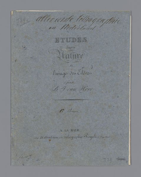
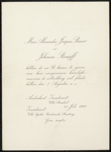
Here we have the title page from an 1892 edition of Oliver Goldsmith's 'The Vicar of Wakefield.' Notice the arrangement of the text: the title is at the top, followed by the author and then the details of the preface and illustrations. The font feels both traditional and stylish, using curved lines. The arrangement of text creates a balanced yet dynamic composition. Each line is centered, yet the varying lengths and styles of the fonts create a visual rhythm. This considered layout creates a sense of harmony. Consider the semiotics at play. The font evokes a sense of classicism, aligning the book with a tradition of literary excellence. The publisher's information at the bottom anchors the book in a specific time and place. The materiality of the page itself, with its texture, is integral to the reading experience and the overall impression of the book. The font and layout work together to create a hierarchy of information, guiding the reader's eye and establishing the tone for the text.
Comments
No comments
Be the first to comment and join the conversation on the ultimate creative platform.
