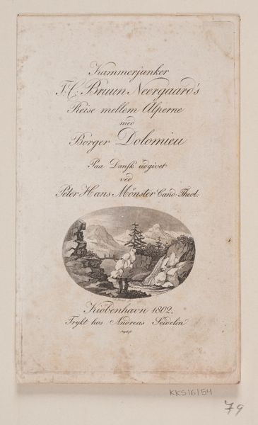
Curatorial notes
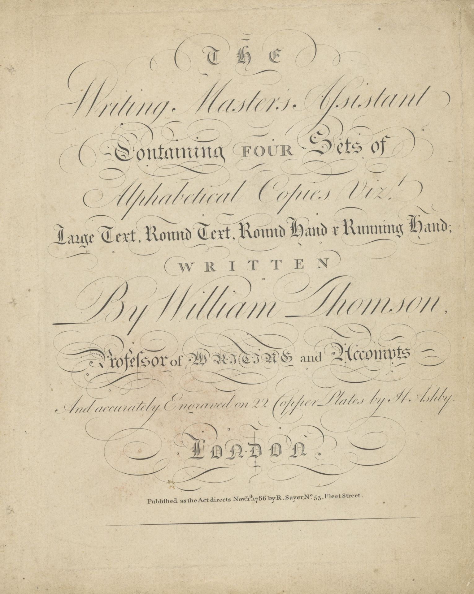
This instructional writing manual was engraved on copper plates by H. Ashby in 1786, displaying various calligraphic styles. The flourishes and elegant lines are not merely decorative; they carry the weight of tradition and the aspiration for mastery. Observe how these stylized letters echo the forms of classical architecture—the serifs reminiscent of pediments, the curves evoking the volutes of Ionic columns. This connection is no accident; Renaissance humanists saw handwriting as a noble art, linking intellectual pursuits to aesthetic beauty. The ambition of the writer to master these complex forms is a mirror of our human desire to understand and control our world. Consider the cyclical nature of learning and imitation embedded in this manual. Each stroke, carefully copied, becomes a gesture of connection to past masters, a reenactment of cultural memory. These alphabets, thus, are not static symbols but living forms, continually reshaped by each new hand that traces them.