painting, acrylic-paint
#
painting
#
acrylic-paint
#
geometric
#
abstraction
#
modernism
Copyright: http://www.stigbroegger.net/shooting
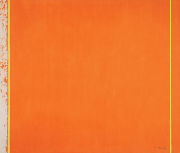
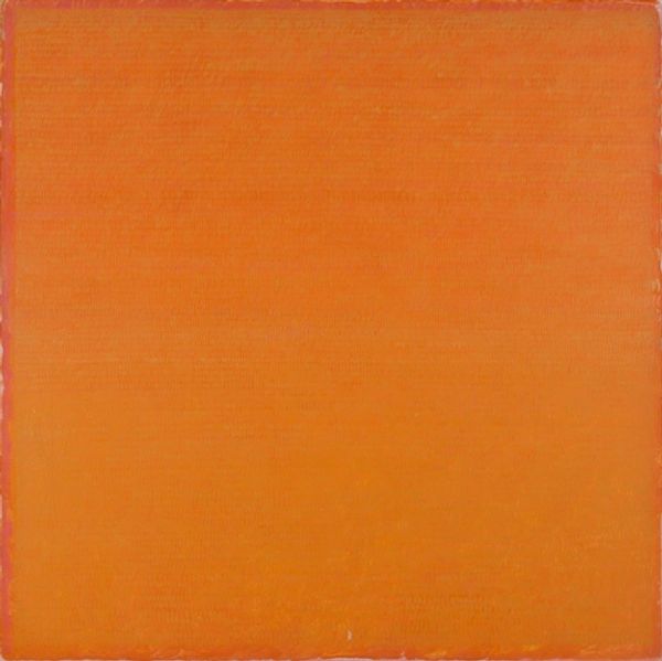
Editor: Here we have Stig Brøgger’s "Composition 3," created in 1980 using acrylic paint. I am immediately struck by the interplay between the stark orange background and the grey form in the upper corner. How do you approach a work like this? Curator: From a Formalist perspective, the aesthetic impact lies primarily in the relationship between the components themselves. The rough-edged rectangle of vivid orange establishes a strong, dominant plane. Observe the texture. How would you characterize its application? Editor: It seems very flat and opaque, almost intentionally manufactured in its evenness. What effect does that flatness create, set against the gestural mark above it? Curator: Precisely. This calculated contrast emphasizes the materiality of the paint itself. The grey element, seemingly arbitrary in form, introduces a dynamic counterpoint. We have the formal language of geometric abstraction challenged by an irregular, almost cloud-like shape. It becomes a visual push and pull between control and chance. Editor: So, the appeal isn’t about any recognizable subject, but about the push and pull you described between form and colour and shape? Curator: Precisely. It prompts us to consider what each shape is doing to the other in a visual conversation. Where does your eye travel and how quickly? Are we observing balance or intentional imbalance? Editor: I see it. The grey shape pulls my eye up and left, away from the solid expanse of orange. I didn't notice that until now! Thanks for the insight! Curator: A pleasure. Analyzing the elements, the form and color and line, allows a path for discovery beyond the need for external context. It reveals that art resides in those relationships.
Comments
No comments
Be the first to comment and join the conversation on the ultimate creative platform.
More like this