Copyright: Camille Graeser,Fair Use
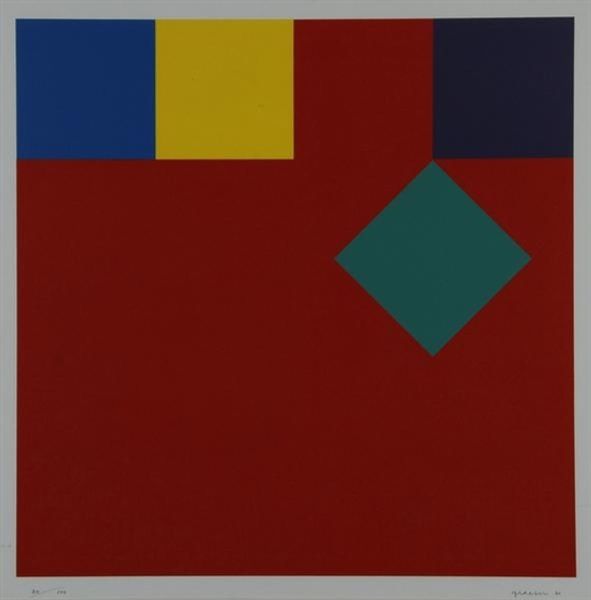
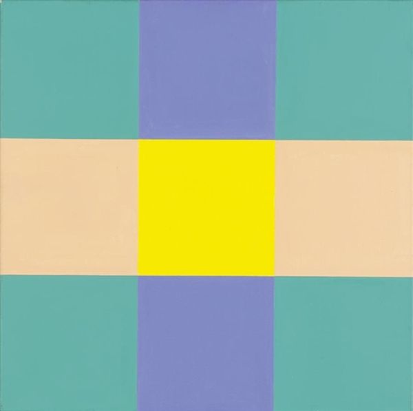
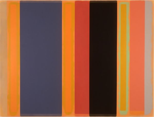
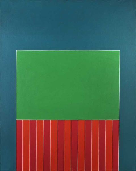
Editor: Here we have Camille Graeser’s "Grün / Orange 3:1," created in 1979 with acrylic paint. It's such a bold piece! The sharp lines and contrasting colors immediately give it a modern, almost digital feel, despite being painted decades ago. What do you see in this work? Curator: It’s a conversation, isn’t it? An argument, maybe even a slightly tipsy one. Grün, that sort of cool teal, is doing its own thing – vast and contemplative, holding space for itself like it’s telling you a secret. And Orange... Well, Orange barges in with that rigid geometry, that demanding verticality. Editor: I hadn't thought of it that way! So you see it almost as a… dynamic? Curator: Absolutely. It's a dialogue of colour. Graeser plays with proportion—that 3:1 hinted in the title. He's dividing the canvas not just with color, but with an almost architectural sensibility. It's hard-edged, a bit defiant even. Almost reminds you of how our eyes argue with what they are viewing. Doesn’t it make you wonder which colour wins the viewer’s eye? Editor: It does! I think my eye keeps going back to the orange, because of that bright, unexpected square in the top corner. Curator: Exactly! That’s the little wink that pulls you back in. I appreciate the artist holding that space to cause friction. Colour is the ultimate material in his toolbox to challenge perceptions and the eye! Editor: That's a completely different way of seeing it. Now, I see the colors battling for space. Curator: Yes, that push and pull... It wakes us up to the simplest forms and colors, demanding we question the nature of our reality.
Comments
No comments
Be the first to comment and join the conversation on the ultimate creative platform.
More like this