drawing
drawing
fantasy-art
figuration
Copyright: Erte,Fair Use
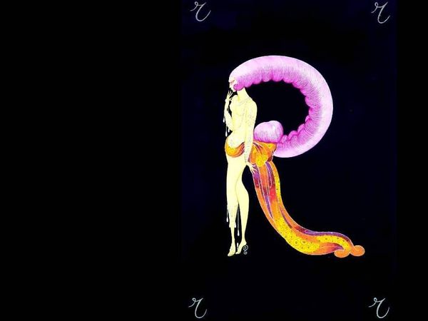
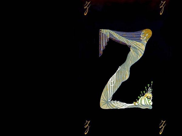
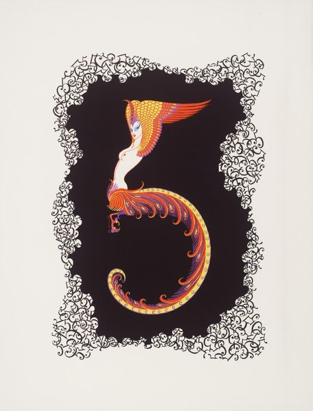
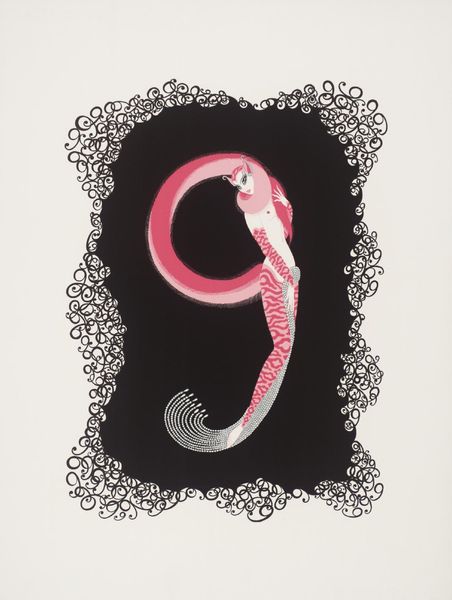
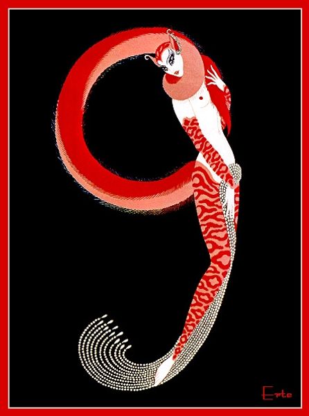
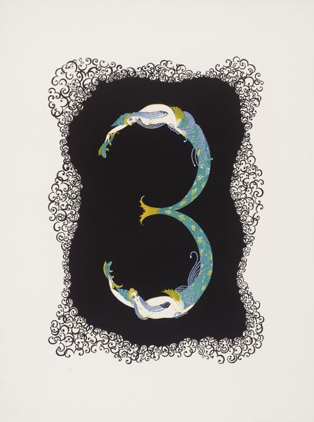
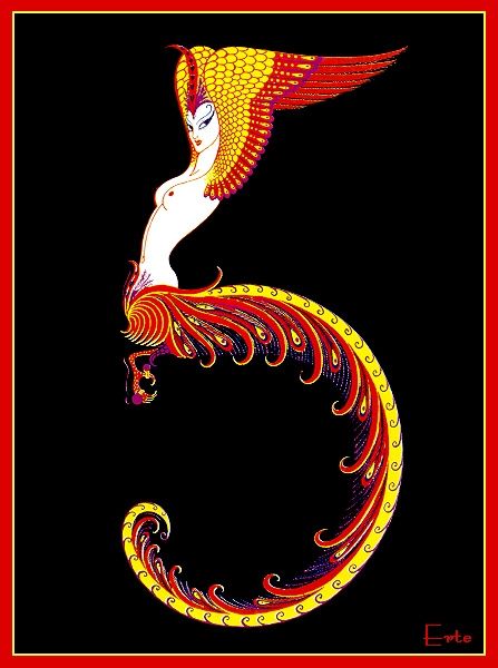
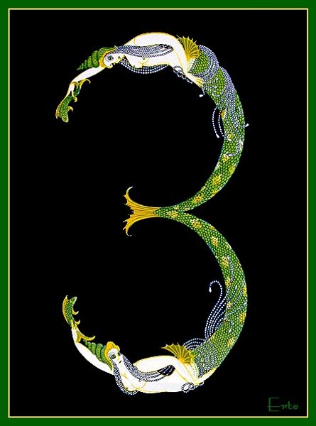
Erte designed ‘Alphabet G’ as part of a series, likely using gouache or watercolor, common for commercial illustration. Here, we see an emphasis on line and color rather than volume, reflecting the artist's background in fashion design, where surface embellishment reigns supreme. The sinuous figure merging woman and fish, is reminiscent of Art Nouveau aesthetics. What sets Erte apart, however, is his embrace of mass reproduction. His designs were conceived not for unique display, but for widespread consumption. This gets to the heart of Erte's practice, which straddles the line between fine art and commercial design. While a painting is unique and hand-made, Erte's work gained value precisely through its reproduction on magazine covers and prints. Consider too, the immense labor involved in producing these images on a mass scale, involving printing presses, distribution networks, and a vast audience of consumers. It pushes us to reconsider the value we place on materials, making, and context, in both art and commercial production.
Comments
No comments
Be the first to comment and join the conversation on the ultimate creative platform.