graphic-art, print, typography, engraving
#
graphic-art
#
light pencil work
#
pen drawing
# print
#
pen sketch
#
typography
#
geometric
#
pen-ink sketch
#
thin linework
#
pen work
#
sketchbook drawing
#
northern-renaissance
#
sketchbook art
#
coloring book page
#
engraving
#
doodle art
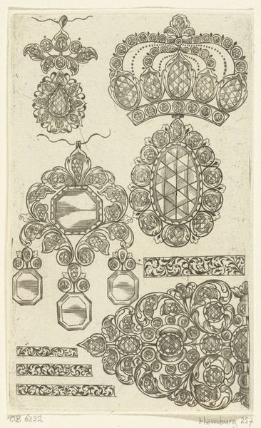
Dimensions: height 142 mm, width 113 mm
Copyright: Rijks Museum: Open Domain
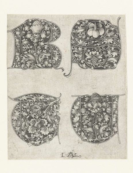
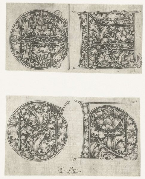
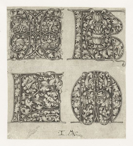
Curator: Oh, I do love stumbling upon these quieter corners of the collection. This print, “Hoofdletters N, O, P en Q”, roughly translates to Uppercase N, O, P, and Q, and was made somewhere between 1455 and 1503 by Israhel van Meckenem. It's a delicate engraving. What's catching your eye about it? Editor: There’s an intense intricacy at play here that feels very...contained. It gives off an almost claustrophobic feel despite the airy linework. The ornate detail fights with the rigid geometric structure of the letters themselves, making it both decorative and slightly unnerving. Curator: I see what you mean! Like a garden deliberately, meticulously placed within confining shapes. Considering this was the Northern Renaissance, it does reflect that era's intense focus on detail. It was created using the engraving technique, a pretty painstaking process involving carving lines into a metal plate. Imagine the patience! Editor: And who controlled the means of that production, right? These highly skilled engravers, typically men, would have determined what visual knowledge was being disseminated. Typography wasn't just about aesthetics; it was deeply connected to power structures, literacy rates, and who had access to information during a time when knowledge was carefully guarded. Curator: That’s fascinating. I mean, looking at these letters, all dressed up in foliage and flourishes, I can't help but wonder if van Meckenem was just having fun. Sometimes art is simply about the joy of creation. Does it always need to carry the weight of social commentary? Editor: Art doesn’t *need* anything, but denying the social forces at play when these objects were created, bought, and circulated, is a huge disservice. These weren’t created in a vacuum. And what kind of messages did these meticulously crafted, expensive letters convey about literacy and access? Who was this “joy of creation” intended for? Curator: Point taken. It’s a tightrope walk, appreciating the craftsmanship while staying alert to those critical questions. It definitely complicates my initial, innocent enjoyment of it, but that’s probably a good thing. Editor: Precisely! For me, confronting those tensions breathes so much more life into art history. And it transforms my viewing experience too!
Comments
No comments
Be the first to comment and join the conversation on the ultimate creative platform.
More like this