La Vera Perfettione del Disegno di varie sorti di recami, page 2 (recto) 1567
0:00
0:00
drawing, graphic-art, print, textile, typography
#
drawing
#
graphic-art
# print
#
textile
#
11_renaissance
#
typography
#
italian-renaissance
Dimensions: Overall: 6 5/16 x 8 7/16 in. (16 x 21.5 cm)
Copyright: Public Domain
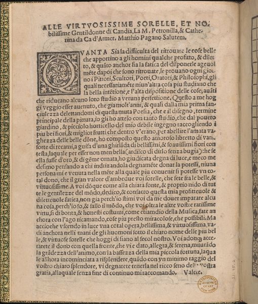
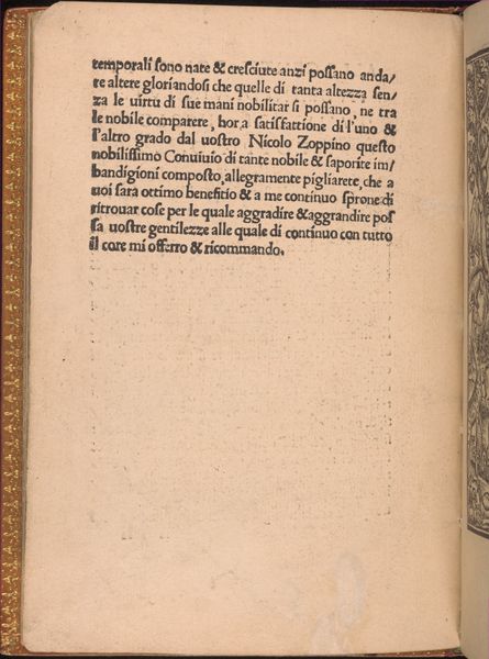
This page, created by Giovanni Ostaus around 1600, presents itself as a carefully arranged tableau of text and image. The immediate visual impression is one of formal structure, dictated by the grid of the printed word. The weight and density of the black ink create stark contrasts against the off-white paper, emphasizing the visual rhythm and balance of the composition. The artist uses the structural framework of the page to convey a sense of order and refinement, typical of Renaissance ideals. The text, arranged in neat columns, serves as both content and form, embodying the humanist interest in language and learning. We can consider that the initial capital letter decorated with a drawing of foliage serves as a semiotic marker, signalling a new section, or a new idea within the text. Ultimately, the lasting impression of this page is its self-conscious construction. The arrangement of the text and the inclusion of ornamental elements speak to a culture deeply invested in the power of the printed word. It's a reminder that art, in any form, is always embedded within a network of cultural and intellectual values.
Comments
No comments
Be the first to comment and join the conversation on the ultimate creative platform.
More like this