print, photography
#
portrait
# print
#
photography
#
modernism
Dimensions: height 55 cm, width 38 cm
Copyright: Rijks Museum: Open Domain
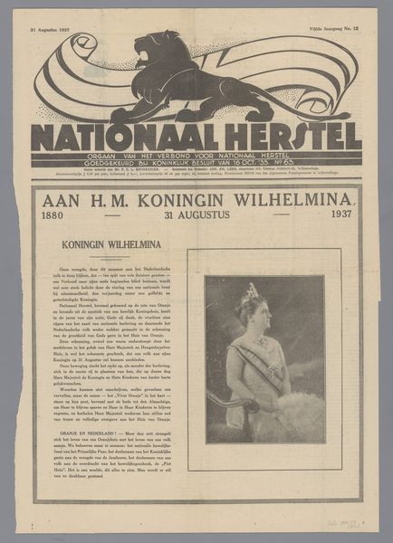
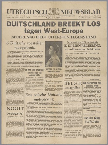
This newspaper, "Nationaal Herstel," was printed in 1934 by the Verbond voor Nationaal Herstel. The bold, blocky title and the graphic lion feel so definitive and authoritarian. The use of stark black ink creates a sense of urgency, as if the news is too important to be softened by subtlety. The texture of the paper itself, worn and aged, speaks to the passage of time. There’s a tension between the crispness of the print and the fragility of the material. It reminds me of how easily information can be disseminated, but also how easily it can be lost or forgotten. Look at the way the ink bleeds slightly into the paper, blurring the edges of the image of the queen. It is a reminder that history is not always clear-cut. The contrast between the imposing title and the somber photograph of the queen is striking. It’s as if the newspaper is trying to assert its power while simultaneously acknowledging a moment of national grief. It reminds me of Dadaist collage, where found images and text fragments were recontextualized to challenge conventional modes of representation. This newspaper invites us to question the relationship between image, text, and power.
Comments
No comments
Be the first to comment and join the conversation on the ultimate creative platform.
More like this