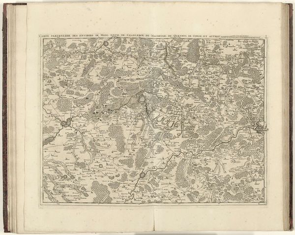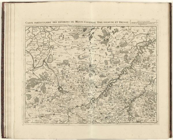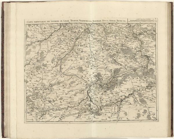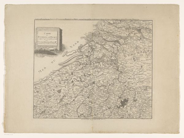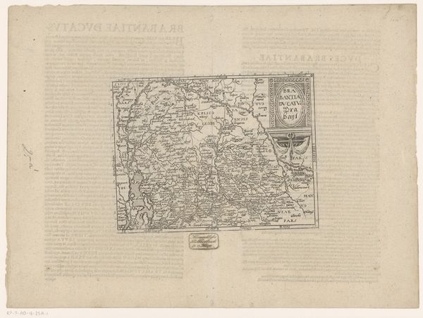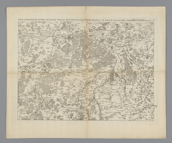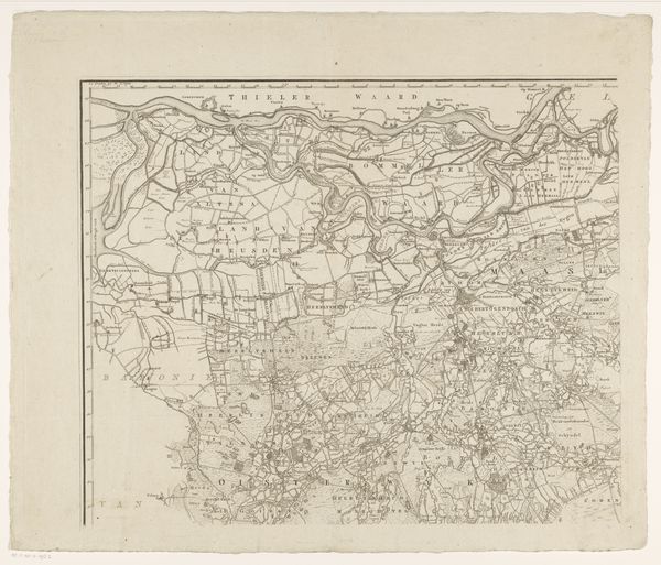
1706
Kaart van Brabant, 1706
Jacobus Harrewijn
1660 - 1732Location
RijksmuseumListen to curator's interpretation
Curatorial notes
Editor: This is Jacobus Harrewijn's "Kaart van Brabant, 1706", an engraving in ink. It's so intricate, almost like a very detailed tapestry. What strikes me most is the density of the lines; it’s incredibly busy. How do you interpret this work from a formalist perspective? Curator: Indeed, the sheer density is the key. Note how Harrewijn uses hatching and cross-hatching to create a sense of depth and texture, manipulating line weight to define topographical features. What impact does this intense detail have on your experience of the image as a whole? Editor: It almost overwhelms me! It’s hard to focus on any one thing. It feels very different from, say, a modern map designed for clarity. Curator: Precisely. The absence of simplification pushes us to consider the materiality of the print itself. Notice the even distribution of light and dark across the composition. How does that affect the sense of space, compared to works with dramatic chiaroscuro? Editor: It makes it feel flatter, more like an abstract design than a realistic representation. Is that intentional? Curator: Consider the function of a map. While accuracy is paramount, Harrewijn is also showcasing his skill as an engraver. The network of lines becomes its own subject. Note the geometric shapes created by clusters of trees. Do you see a tension between representation and pure form? Editor: I do, now that you point it out. It's both a map and a demonstration of artistic technique. It almost feels like the landscape is an excuse to explore the possibilities of engraving! I never thought to look at a map that way before. Curator: Understanding the visual elements can lead to richer engagement, and offer unique appreciation for the choices that go into making it.