Copyright: Modern Artists: Artvee
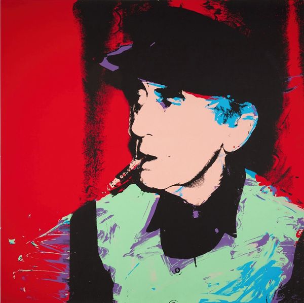
Andy Warhol made this print of Willie Shoemaker, and you can see how his signature screen-printing style reduces the image to essential colors and shapes. The repetition and slight misalignments are all part of the process, part of the fun. It’s interesting to consider the materiality of this image. The flat blocks of color are so characteristic of Warhol, it’s almost like he's not just depicting Shoemaker but commenting on the idea of celebrity itself. The contrast between the orange and black creates a bold, graphic impact. Look closely, and you can see the texture of the ink on the surface, a subtle reminder of the physical act of printing. See that green splash in the background? It’s so spontaneous; it’s like Warhol let the medium speak for itself. I think about artists like Elizabeth Murray, who also embraced bold colors and graphic elements but with a more painterly approach. With Warhol, nothing is ever just one thing; there are layers of meaning and process embedded in every mark.
Comments
No comments
Be the first to comment and join the conversation on the ultimate creative platform.
More like this