Copyright: Modern Artists: Artvee
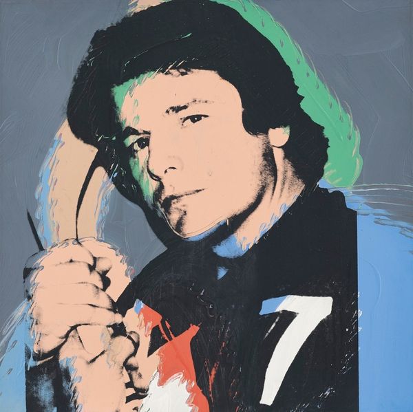
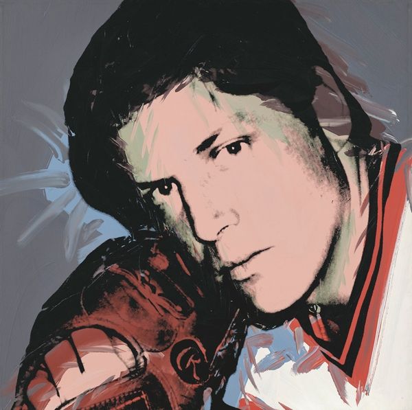
Andy Warhol made this portrait of Vitas Gerulaitis, the tennis player, and it’s like Warhol's giving us a glimpse behind the scenes, into the making of an icon. There's a real buzz of activity, a kind of organised chaos in the colour and the mark making. Look at how the salmon pink of Vitas’s jacket smudges into the blue of the background, or the green shadow slashed onto his face. These are not mistakes; they're part of the plan. It's like Warhol’s saying that making an image is a process of layering, of pushing and pulling. Those scribbled lines over the tennis racket, they’re not just filling space, they're adding energy, like the whole image is vibrating. Warhol's work always makes me think of Rauschenberg and his messy silkscreens. These are both artists reminding us that art isn't about perfection. It’s about embracing the unexpected and finding the beauty in the process.
Comments
No comments
Be the first to comment and join the conversation on the ultimate creative platform.
More like this