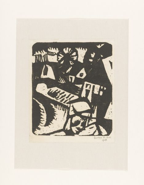
print, linocut, woodcut
#
toned paper
#
linocut
# print
#
linocut
#
asian-art
#
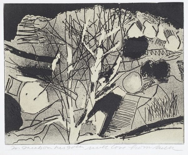
landscape
#
linocut print
#
woodcut
#
abstraction
#
monochrome
Copyright: National Gallery of Art: CC0 1.0
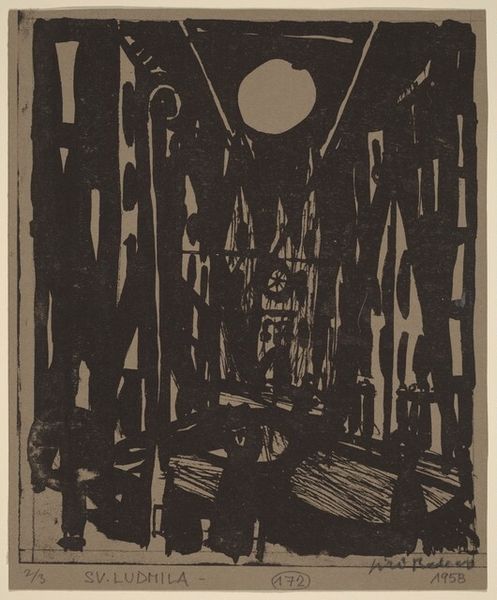
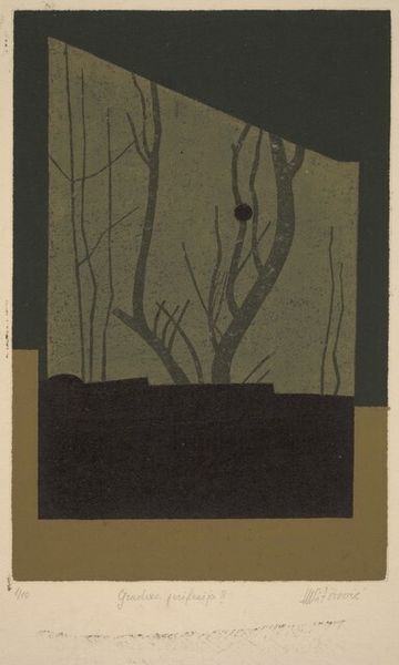
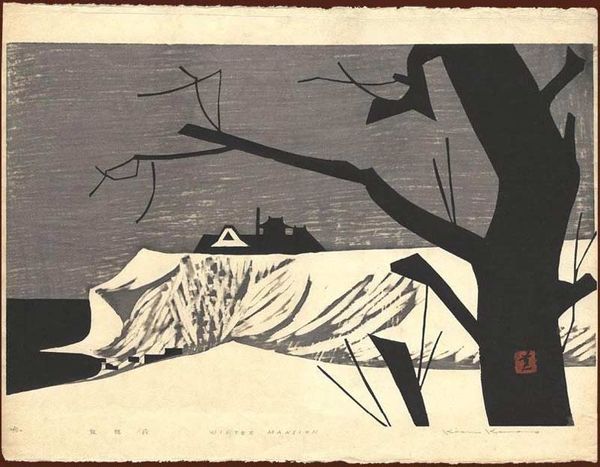
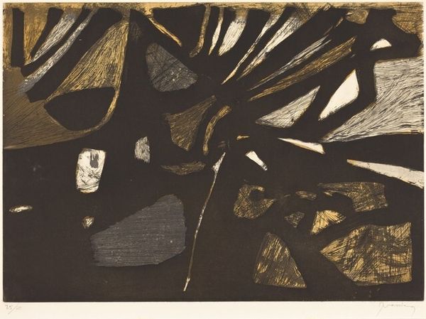
Curator: Welcome. Before us, we have Kiyoshi Saito’s linocut print, “Gioji, Kyoto,” created in 1955. Editor: It has a somewhat somber presence. The stark contrast between the dark forms and textured background creates an unsettling quietude, wouldn’t you say? The black is so absolute, and the architectural form dominates the frame, it does have quite an ominous presence. Curator: Absolutely. The monochromatic scheme reduces the scene to its fundamental shapes. Look at the interplay of the verticals of the stylized bamboo forest with the geometric forms that create a somewhat recognizable building structure. Editor: And these shapes—circles and lines—juxtaposed so starkly make me consider the broader movement of prints within post-war Japan. What kind of shifts was Saito experiencing in Japanese society? Curator: The Sosaku-hanga movement, of which Saito was a vital part, comes to mind. This “creative print” movement emphasized the artist's role in designing, carving, and printing, which offered the opportunity for intensely personal work. Here, he has simplified the scene, abstracting traditional forms into bold design elements. Editor: So you're saying this print reflects more than just aesthetics—it mirrors this idea of artistic autonomy against a backdrop of postwar reconstruction. Were prints used for national promotion at this point? Was the monochrome a nod to austerity or the Zen of simplicity? Curator: I'd posit the aesthetic choice speaks to the Sosaku-hanga artists breaking with conventions. Also, it could reflect the influences of the abstract art and design movements from the West that gained traction at the time, so perhaps something very individual as a stylistic statement? The flattening of perspective is definitely notable, adding to the overall design aesthetic. Editor: I agree! These simple shapes are not random: they resonate on many cultural and societal levels. Each viewer might perceive a slightly different meaning, depending on their backgrounds, no? It becomes this nexus of national identity and international stylistic innovation, framed during a pivotal era. Curator: Precisely. By looking at the lines and their placement, we're unraveling those cultural connections within its visual architecture. Thank you for illuminating it with your historical lens. Editor: And thank you, for your meticulous visual analysis – together, the piece is rendered with even greater significance.
Comments
No comments
Be the first to comment and join the conversation on the ultimate creative platform.
More like this