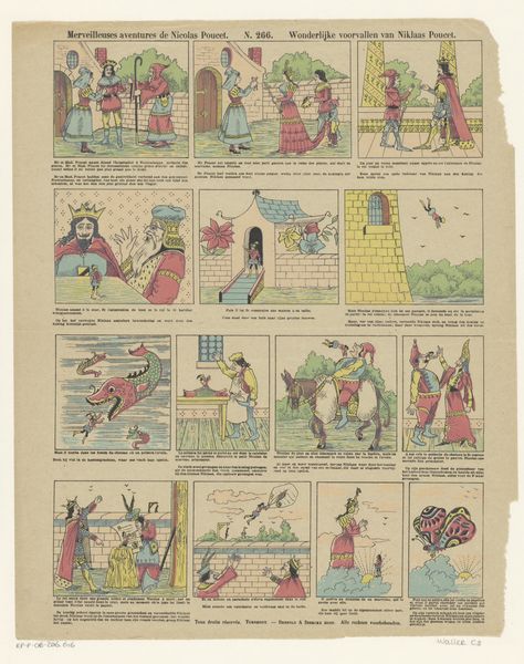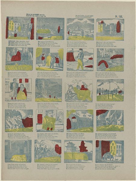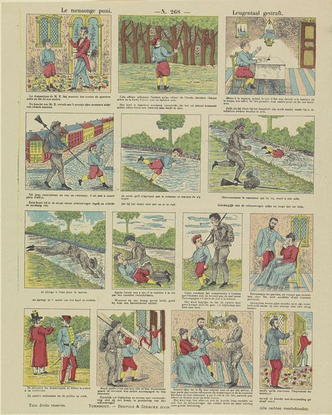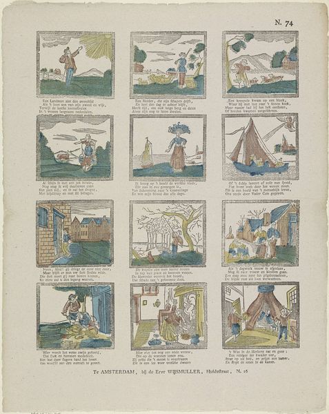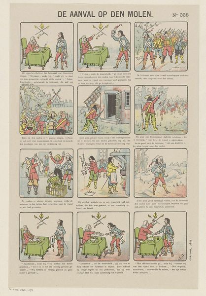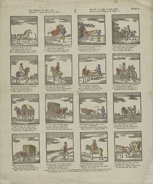
Le cheval de la fée Printemps / Het paard der toovernimf Lente 1833 - 1911
brepolsdierckxzoon
Rijksmuseum
graphic-art, print, ink
graphic-art
comic strip sketch
narrative-art
pen sketch
figuration
personal sketchbook
ink
sketchwork
ink drawing experimentation
thumbnail sketching
comic
horse
line
pen work
sketchbook drawing
genre-painting
storyboard and sketchbook work
sketchbook art
Dimensions: height 381 mm, width 301 mm
Copyright: Rijks Museum: Open Domain
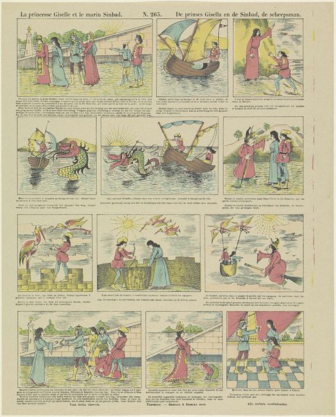
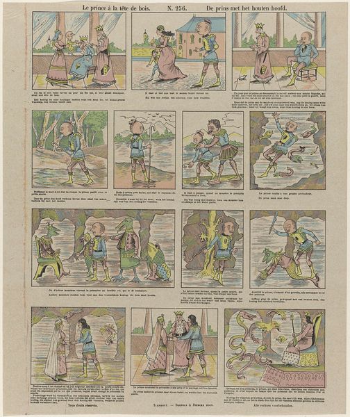
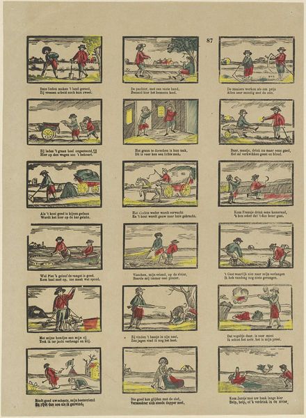
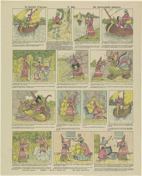
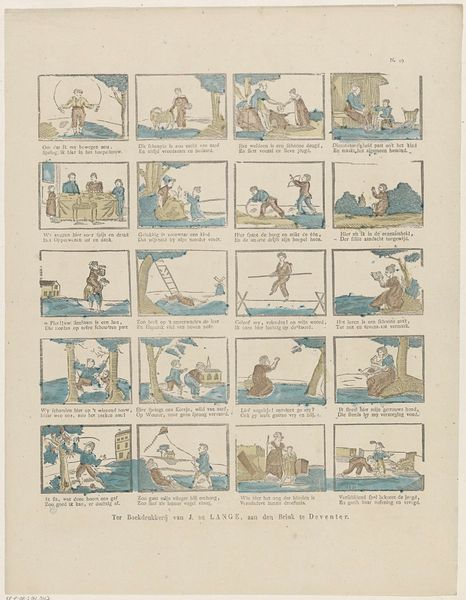
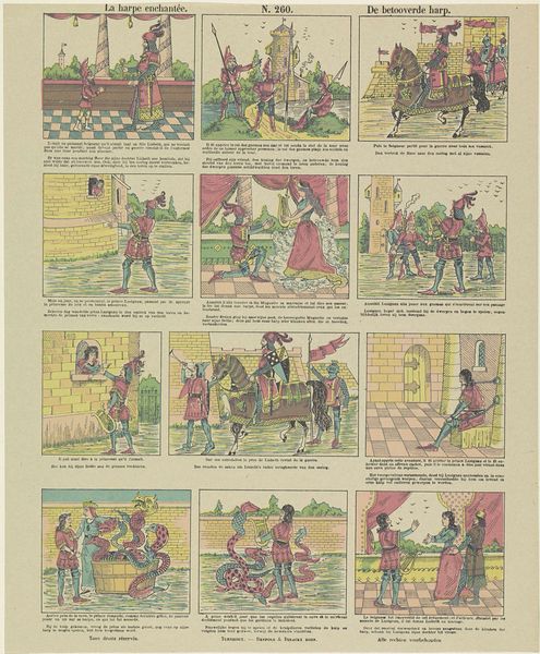
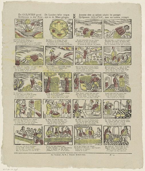
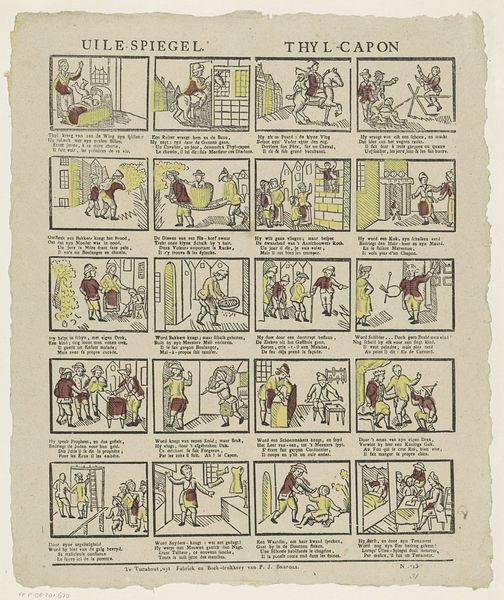
Curator: This Brepols & Dierckx lithograph, playfully titled "Le cheval de la fée Printemps," or "Het paard der toovernimf Lente" in Dutch, is something else. I’m just fascinated by the… hm, almost haphazard charm of these early comic strips. The dates listed, 1833 to 1911, I find slightly curious though. Editor: My initial impression is whimsical disarray! Twelve vignettes vying for attention, the colors a pastel-toned muddle... and yes, as you mention, those dates seem curious. Were these designs produced across decades, then? Curator: Quite possibly! My hunch? This may have been a compilation from their studio, possibly even for reuse across different publications. See the adventurous fellow who features in each scene? Each small panel reads almost like a dream log, right? Like scraps of imagined stories. A tiny stage for imagination. Editor: The linework seems remarkably consistent. But look, the framing, the panel divisions— such uneven margins... I find my eye struggling to establish a clear compositional rhythm. It fights against that narrative thread that unites this man through it all. It’s organized... but aggressively asymmetrical. The composition echoes early 20th-century experimentation. Curator: Absolutely. And consider how that asymmetry jars us! Because even the limited color palette - these almost shockingly flat color fills – somehow adds to that organized chaos! I feel pulled between the primitive directness, that graphic flatness you observe, and… is it just me, or is there some sly satire glinting around the edges of those scenarios? That recurring gentleman certainly experiences some curious incidents... Editor: Indeed, I catch that. The visual disorganization perhaps functions as a key—to be satirical! What, ultimately, can be harmonious in its design but not a little dull? Curator: Oh, precisely. Sometimes the messiest sketches spark the brightest ideas, right? And that the printer added both French and Dutch captions only adds to that beautiful chaos! Editor: Agreed. An object that invites endless creative interpretation... even despite its visual eccentricities.
Comments
No comments
Be the first to comment and join the conversation on the ultimate creative platform.
