Copyright: Public Domain: Artvee
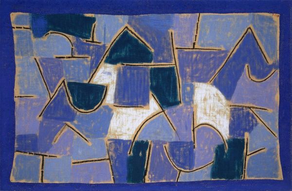
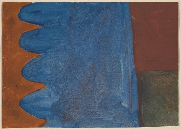
Curator: Paul Klee's 1939 watercolor and ink on paper work, titled "Rocks at Night," presents a fascinating interplay of geometric forms. What are your first impressions? Editor: Well, my immediate reaction is one of subdued richness. It’s dominated by blues and greys, giving it a weight and depth that contradicts the light, translucent nature of watercolor. It feels surprisingly monumental for its scale. Curator: Yes, the colors certainly evoke a feeling of stillness, reflecting the somber tones of night, and a sort of cool serenity. Looking at the composition, one sees a puzzle, perhaps deliberately disorienting, to represent nature through the language of abstraction. There is that expressive use of line and shape that he's known for... Editor: Absolutely, but I’m particularly interested in how that effect is achieved. You've got watercolor on paper—fragile, absorbent. The way Klee controls and layers those washes to achieve such varying opacities within these outlined forms, and the textures within those flat washes – that’s where the artistry really shines through for me. What do these rocks *mean* to you? Curator: The rocks themselves may be more psychological than physical; Klee worked under immense personal turmoil in 1939—it was the year he died. His deteriorating health is sometimes believed to have fueled an exploration of inner states through symbols of decay and fragmentation, hence perhaps these angular forms... the rocks representing that stoic endurance or even hardship. The "night," of course, often stands for the unknown, fears of mortality. Editor: I appreciate the emotional context, but I am fascinated by the surface tension he created using such simple materials. The choice of paper as a readily available, everyday support – speaks volumes to me about the democratization of art-making. You didn't need grand, prepared canvas to say something profound about the inner and outer worlds. Curator: And he clearly says so much! Looking closely reveals a nuanced blend of formal rigor and raw emotional vulnerability—something profoundly characteristic of the period in Europe leading to the war. Editor: Indeed. This piece reminds us that meaning can be unearthed through process and the careful consideration of humble materials. It makes me look at watercolors in a totally different light!
Comments
No comments
Be the first to comment and join the conversation on the ultimate creative platform.
More like this