Curatorial notes
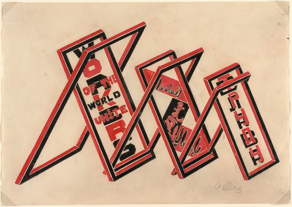
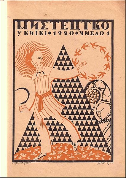
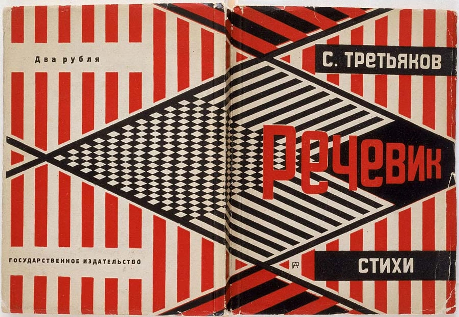
This is a book cover by Alexander Rodchenko, where form feels as crucial as the content. It’s a visual shout, using red, black, and white to grab your attention—no soft whispers here. The design feels built, like a structure, with those hard-edged stripes and geometric shapes. I imagine Rodchenko carefully placing each element, thinking about how they lock together, almost like a puzzle. It's not just decoration; it's architecture on paper. Look at how the black and white diamond pattern clashes with the vertical stripes; it creates this visual vibration, a kind of optical buzz. The red title pops against the black stripes. It’s this combo of simple shapes, bold colors, and sharp lines that makes it so effective. It reminds me a bit of some of El Lissitzky’s graphics, also playing with geometry and type. It shows how the conversation between artists evolves, each adding to the dialogue, remixing ideas, and pushing the boundaries of what art can be.