Copyright: Modern Artists: Artvee
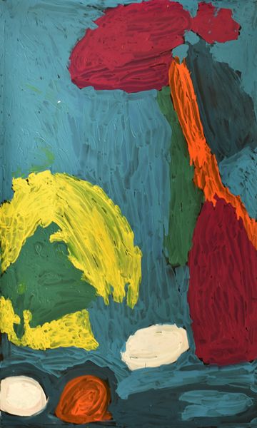
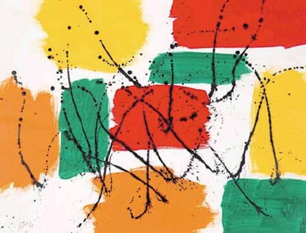
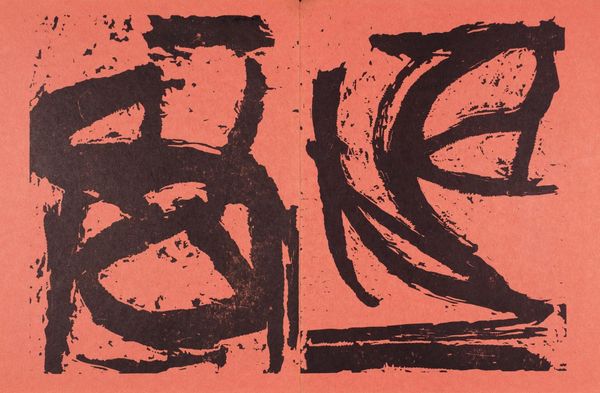
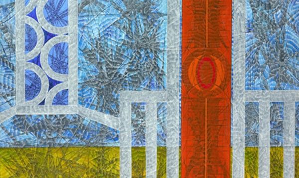
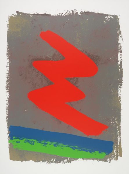
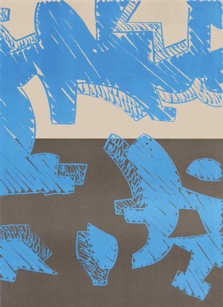
Andy Warhol made this Dollar Sign by printing in a number of different colours. It's like he's asking us to think about the money as a process, not just a result. There's something so raw about the texture here, a kind of immediacy to the marks. It’s not just about the image, but about the way the ink sits on the canvas. Look closely, and you can see all these tiny little crayon strokes, like the image has been built up layer by layer. I keep thinking about Rauschenberg’s screenprints, which were rough and ready in a similar way, but Warhol really puts the emphasis on the everyday, using such simple and bold colours and that instantly recognizable dollar sign. I mean, what's more ambiguous than money? It can mean everything or nothing at all.
Comments
No comments
Be the first to comment and join the conversation on the ultimate creative platform.
