print, typography, poster
# print
#
typography
#
poster
Dimensions: height 343 mm, width 211 mm
Copyright: Rijks Museum: Open Domain
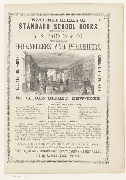
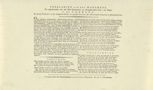
Curator: Looking at this printed poster, circa 1830, titled "Reclamebiljet van Charles Dury, boekverkoper te Southampton"— which translates to "Advertising Poster of Charles Dury, Bookseller in Southampton"— I am immediately struck by how densely packed it is with text. It makes me wonder about its effect on the passersby. Editor: It definitely commands attention, doesn’t it? Almost imposing. I’m particularly drawn to the variety of typefaces; each listing, from "Standard Publications" to "Family Bibles," is announced in a distinctive style. To me, they read like subtle proclamations of intellectual wealth and the deeply anchored values in literacy during the period. Curator: Indeed. Its visual language is inextricably bound with the burgeoning print culture of the 19th century. This wasn’t just about advertising books; it was about asserting the social value of reading and education and also offering social mobility. Think of the London Encyclopaedia alongside French authors, classic literature, divinity. It's like Dury was offering a slice of worldliness, and spiritual fulfillment. Editor: I can see that, the way that selection emphasizes a comprehensive selection of accessible knowledge, and speaks volumes. But there’s also the implication of moral betterment within easy reach, from "Family Bibles" to works of literature. It’s strategically presenting itself, doesn’t it. This is a very early kind of social engineering that relied upon literacy and religious compliance. Curator: You know, the very format speaks volumes. The printer, M. Barnfield, in smaller font, subtly reinforces Southampton as a hub of commerce and publishing at the time, lending authority to the advertisement and to the printed word itself. It suggests an established industry, vital to the community and the commercial sphere. It shows us that advertising had entered an age of social and commercial relevance. Editor: That’s very astute! I had been focusing on what the typography "said," but didn’t consider the placement of Barnfield. Together, it provides us a window into a world where knowledge was packaged with virtue. Curator: This image shows an interplay of commerce, social influence, and the transformative power of printed words. Its compact format allows the distribution of moral guidance at every city corner. Editor: I think seeing this, and what Dury represented for his time and town, help contextualize Southampton as both the site of local change but also wider progress.
Comments
No comments
Be the first to comment and join the conversation on the ultimate creative platform.
More like this