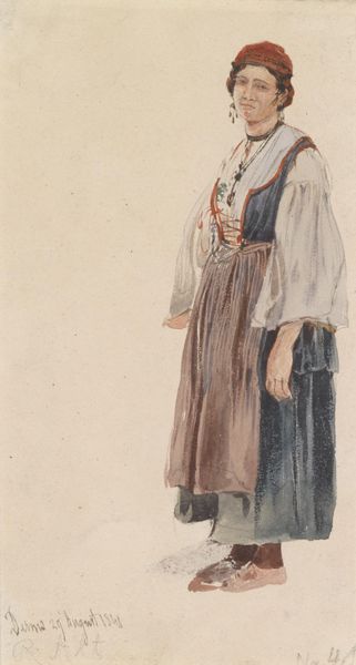
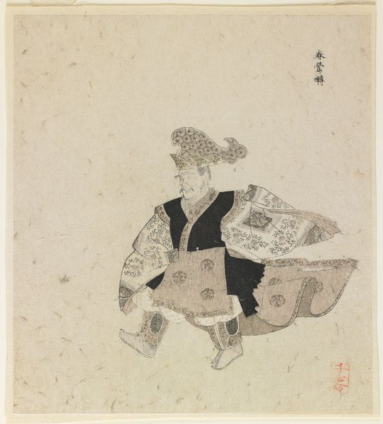
#
toned paper
#
light pencil work
#
pencil sketch
#
personal sketchbook
#
coloured pencil
#
sketchbook drawing
#
watercolour bleed
#
watercolour illustration
#
sketchbook art
#
watercolor
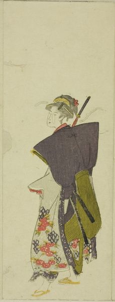
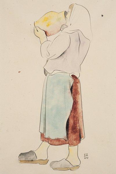
Dimensions: height 316 mm, width 232 mm
Copyright: Rijks Museum: Open Domain
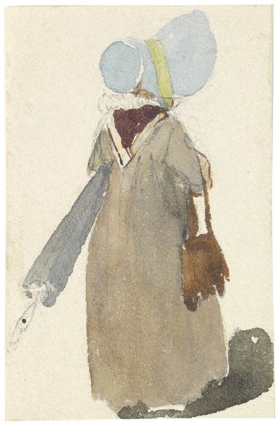
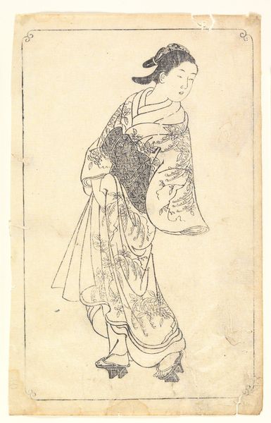
Curator: Here we have "Lopende vrouw" or "Walking Woman" by Leo Gestel, dating from 1891 to 1941. It’s currently held in the Rijksmuseum collection. Editor: My first thought? Solitude, a sort of muted resignation in her posture. The colours contribute, too-- those gentle blues and greys washing over the figure almost render her invisible. Curator: Gestel utilizes watercolour and pencil on toned paper. The lightness suggests this might be a page torn from a personal sketchbook rather than a formal piece intended for exhibition. Notice the subtle bleed of the watercolour; a likely product of paper production costs forcing thinness, which would naturally absorb liquid much faster. Editor: Absolutely, it lends itself beautifully to that watercolour effect, giving everything a fleeting quality as if we are just catching her out of the corner of our eye, and also giving a melancholy effect because it looks more vintage or weathered in a way. She's there, then almost gone, back into the flow of the city… or maybe just escaping the farm. Curator: The details of the cape— the decorative trim picked out in darker hues – offer a glimpse into the sartorial economy of the time. It points to the access and labor invested in garment production of this specific style within the region where the artwork was produced, probably reflective of trade guilds and patterns. Editor: And despite the apparent rush, or perhaps escape, she's wearing such specific articles! Headscarf, voluminous coat, distinct skirt, you're right, all evidence of craft and material worth and value for the time. The choice to depict her back-turned is poignant, like watching someone recede, isn't it? What might Gestel be implying by distancing us this way? Curator: Maybe a detachment typical of modernity, in Gestel's artistic circle. There's a study here of fleeting encounters, the economics of working garments, and even a silent rebellion against established art norms, don't you think? Editor: I like the rebelliousness read-- definitely a shift away from idealized forms! It brings the everyday into focus. Curator: It really prompts me to reconsider what "value" in art and design means in the everyday, doesn't it? Editor: Precisely, seeing worth in the fleeting, in the readily available resources. Makes one want to go and paint in pencil and watercolour now.
Comments
No comments
Be the first to comment and join the conversation on the ultimate creative platform.
More like this