Dimensions: image: 450 x 685 mm support: 540 x 690 mm
Copyright: © Tacita Dean, courtesy Frith Street Gallery, London and Marian Goodman Gallery, New York/Paris | CC-BY-NC-ND 4.0 DEED, Photo: Tate
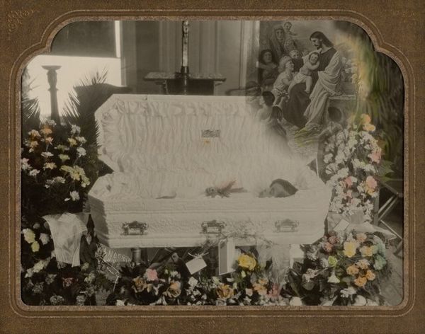
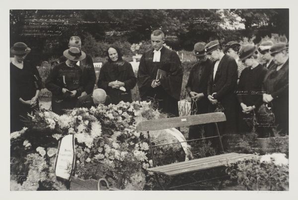
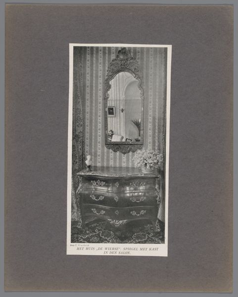
Curator: Tacita Dean's photogravure, "Death of a Priest," presents us with a somber scene. What strikes you upon first viewing? Editor: The overwhelming stillness. The monochrome palette, the arrangement of the casket flanked by flowers and lit candles – it all speaks to a very formal, ritualized farewell. I see writings all over it... Curator: Yes, the artist has inscribed directly onto the print, disrupting the photographic image with textual annotations. In this work, Dean is contemplating the institutional power structures inherent within religious hierarchies, particularly concerning the AIDS epidemic. The handwritten notes offer fragmented glimpses into the personal stories affected by the priest's life and death. Editor: The text adds layers of complexity. It pushes against the stoicism of the image, injecting a sense of personal loss and perhaps even political commentary into the otherwise traditional iconography. Curator: Indeed. Dean's method creates a tension between the photograph's inherent indexicality and the subjective nature of memory and interpretation. Editor: The composition is quite compelling. It’s a stark meditation on loss, yet rendered with a delicate hand. Curator: It's a fitting juxtaposition, given the subject matter. The image lingers in the mind, prompting introspection about faith, community, and mortality.
Comments
tate 12 months ago
⋮
http://www.tate.org.uk/art/artworks/dean-death-of-a-priest-p20252
Join the conversation
Join millions of artists and users on Artera today and experience the ultimate creative platform.
tate 12 months ago
⋮
Death of a Priest belongs to a portfolio of twenty black and white photogravures with etching collectively entitled The Russian Ending. The portfolio was printed by Niels Borch Jensen, Copenhagen and published by Peter Blum Editions, New York in an edition of thirty-five; Tate’s copy is the fifth of ten artist’s proofs. Each image in the portfolio is derived from a postcard collected by the artist in her visits to European flea markets. Most of the images depict accidents and disasters, both man-made and natural. Superimposed on each image are white handwritten notes in the style of film directions with instructions for lighting, sound and camera movements, suggesting that the each picture is the working note for a film. The title of the series is taken from a convention in the early years of the Danish film industry when each film was produced in two versions, one with a happy ending for the American market, the other with a tragic ending for Russian audiences. Dean’s interventions encourage viewers to formulate narratives leading up to the tragic denouements in the prints, engaging and implicating the audience in the creative process.
More like this