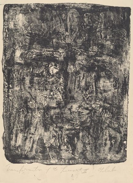
print, graphite
#
abstract-expressionism
#
ink painting
# print
#
pencil sketch
#
abstract
#
line
#
graphite
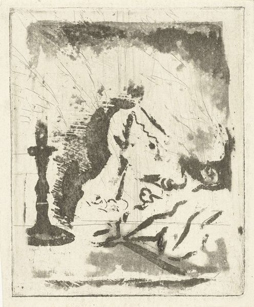
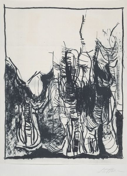
Dimensions: Image: 223 x 191 mm Sheet: 305 x 268 mm
Copyright: National Gallery of Art: CC0 1.0
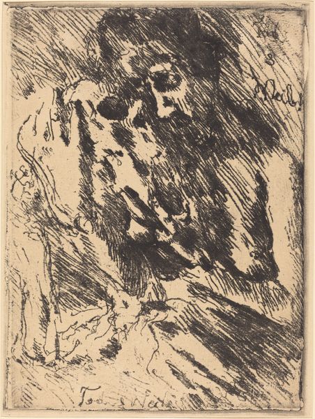
Curator: Standing before us is Walt Kuhlman’s "Untitled (Abstract Composition #1)", created in 1949. It's a print that uses graphite to achieve this intriguing effect. Editor: It's striking, definitely evocative of mid-century angst. The composition is chaotic yet compelling, a swirl of dark and light fighting for dominance within the frame. Curator: Indeed. Consider the material conditions—the paper, the graphite, the printing press itself. These tools enabled Kuhlman to create multiple impressions, democratizing his artistic vision to a degree. Each print then becomes a unique instance, shaped by the pressures of the press, the dispersal and liquidity of ink and by its reception in the broader, art economy. Editor: True, but also consider the lines, some sharp, others blurred, almost like a ghostly landscape struggling to form itself. The tonal range from dense blacks to almost transparent greys creates a real visual drama. It feels unbalanced, unfinished, which contributes to its unsettling nature. Curator: That tension resonates with the socio-political landscape of the time, the post-war anxieties seeping into artistic expression. Was this about expressing or repressing? Kuhlman isn’t just creating a design, he is manifesting a cultural condition with tangible materials. We can assume the artist handled the materials under some particular circumstances related to the socio-economical setting. Editor: Perhaps. The absence of easily recognizable forms is crucial. The interaction of the graphite on the paper suggests not any immediate reading. If we focus solely on materials, aren’t we ignoring how he manipulated graphite to evoke a sense of disquiet? Curator: It's a balancing act, isn't it? Understanding the how informs our comprehension of the why. Looking closely at how Kuhlman created this piece, helps to examine how it embodies and communicates a wider cultural anxiety linked to labour and production. Editor: I appreciate that view. It has helped me appreciate the role and potential meaning of line and composition as much more than formal design, the product of material culture during those tense decades.
Comments
No comments
Be the first to comment and join the conversation on the ultimate creative platform.
More like this