drawing, paper, ink
#
drawing
#
mannerism
#
paper
#
11_renaissance
#
ink
#
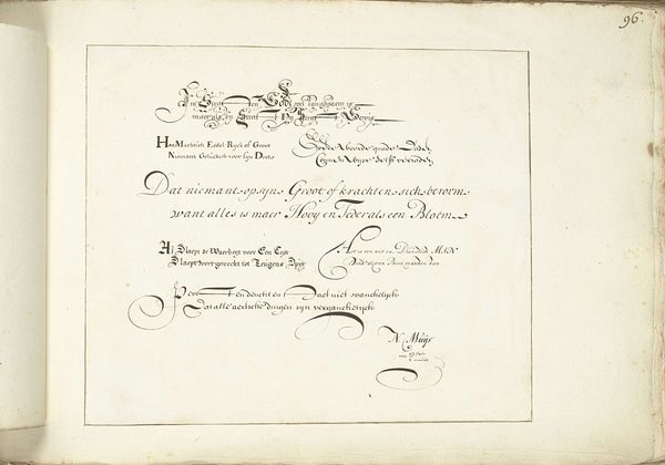
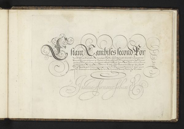
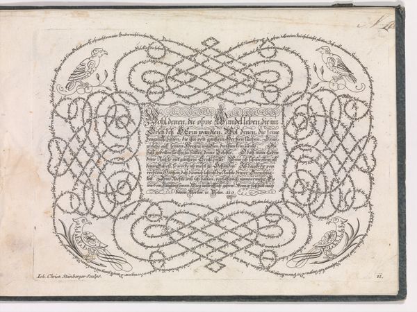
calligraphy
Dimensions: height 199 mm, width 267 mm, height 227 mm, width 345 mm
Copyright: Rijks Museum: Open Domain
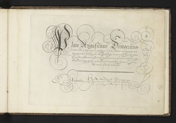
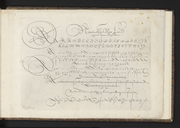
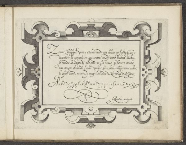
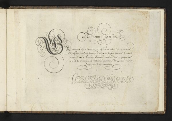
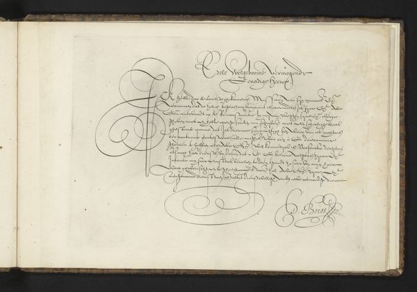
Editor: Here we have "Schrijfvoorbeeld: Raphael d' Urbin (...)" made around 1605 by Cornelis Dircksz. Boissens. It’s an ink drawing on paper, a striking example of Mannerist calligraphy. The delicate lines and swirling forms create an intricate pattern. What can you tell me about the materials and process used to create such a work? Curator: Examining this piece through a materialist lens allows us to consider calligraphy not just as an art form, but as a skilled craft situated within a specific social context. The paper itself, likely handmade, would have been a valuable commodity. The ink, too, comprised of carefully selected materials. Think about the labour involved, from the production of paper and ink to the years of training needed to achieve such mastery of penmanship. This isn’t simply about aesthetics; it's about the material conditions of artistic production. Editor: So, it’s less about the subject of the writing and more about how it was physically created and its value as a commodity? Curator: Precisely! The graceful lines aren’t just beautiful; they represent the skill, time, and material resources invested in the work. Consider how calligraphy was employed: in legal documents, official correspondence, and, of course, art. The consumption of such skill reflected and reinforced existing social hierarchies. This piece exemplifies how artistry can be inseparable from the socioeconomic realities of its time. Editor: That's fascinating! I had only thought of it as decorative. I appreciate how this shifts my perception to consider labor, materials, and the economic aspects. Curator: Exactly, seeing art through this lens reveals hidden connections between aesthetic beauty, material value, and social structures.
Comments
No comments
Be the first to comment and join the conversation on the ultimate creative platform.
More like this