drawing, paper, ink
#
drawing
#
aged paper
#
script typography
#
hand-lettering
#
hand drawn type
#
hand lettering
#
paper
#
personal sketchbook
#
ink
#
hand-drawn typeface
#
thick font
#
sketchbook drawing
#
sketchbook art
#
calligraphy
Dimensions: height 218 mm, width 271 mm, height 227 mm, width 345 mm
Copyright: Rijks Museum: Open Domain
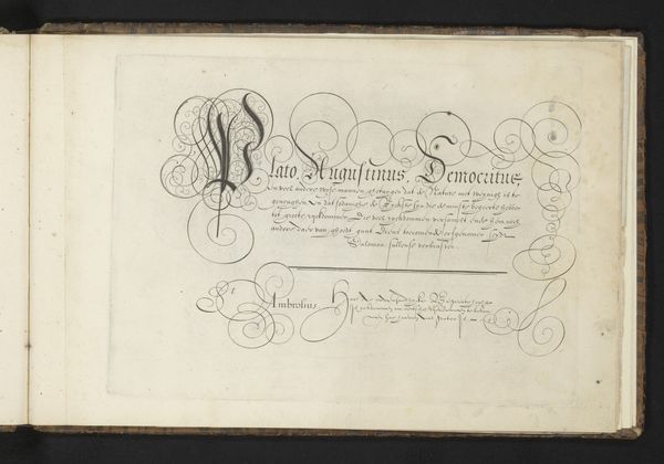
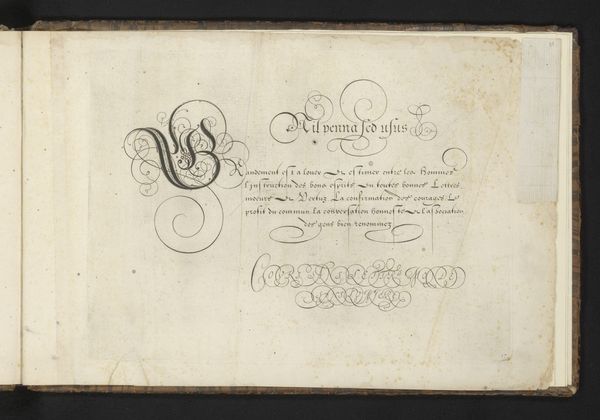
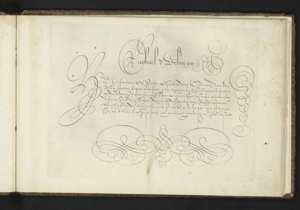
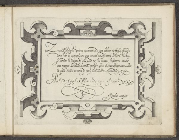
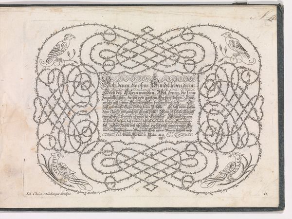
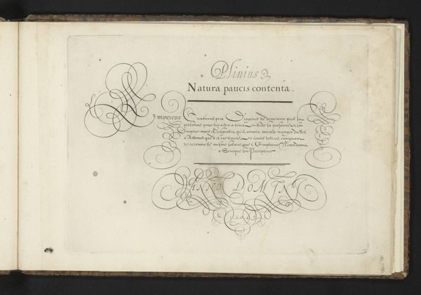
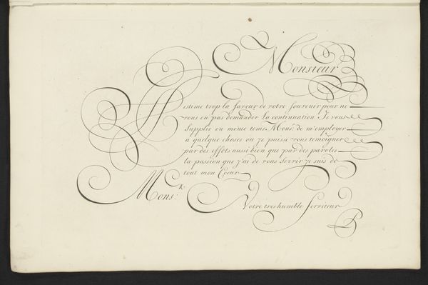
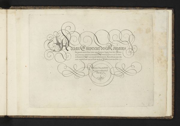
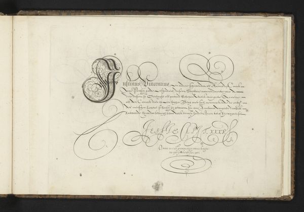
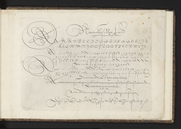
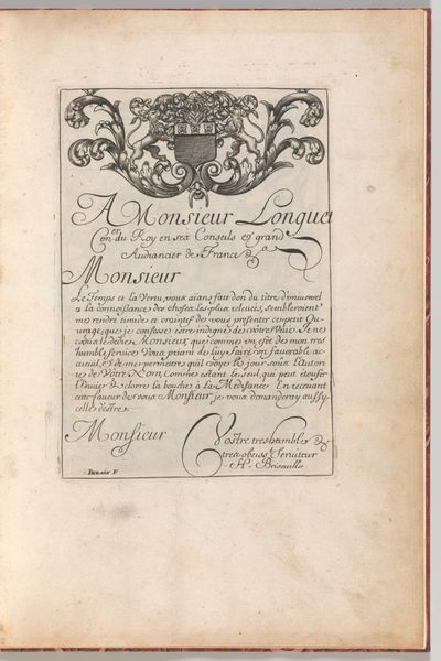
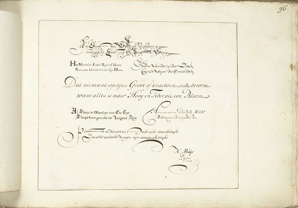
This calligraphic study was made by Cornelis Dircksz Boissens, a Dutch writing master, probably in the early 17th century. It's rendered in iron gall ink, a very common writing material at the time, on paper. Iron gall ink, made from iron salts, tannin, and gum arabic, has a distinctive brownish-black hue and was widely used for writing and drawing from the Middle Ages onwards. The controlled application of this ink through a quill or fine pen allowed Boissens to create the elaborate flourishes, precise lines, and contrasting thick and thin strokes that define the art of calligraphy. The varying pressure and angle of the pen on the paper contributes a textural richness, adding depth to the composition. But more than just a demonstration of technical skill, calligraphy in this period was also about social status, literacy, and the power of communication. Exemplary lettering was highly valued, both as a functional skill for record-keeping and correspondence, and as an art form in its own right. This art represents a social context where the ability to write beautifully was a mark of education and refinement, blurring the lines between craft, utility, and fine art.
Comments
No comments
Be the first to comment and join the conversation on the ultimate creative platform.
More like this