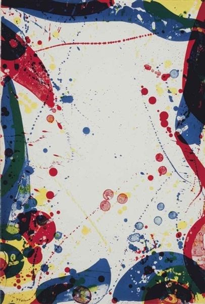
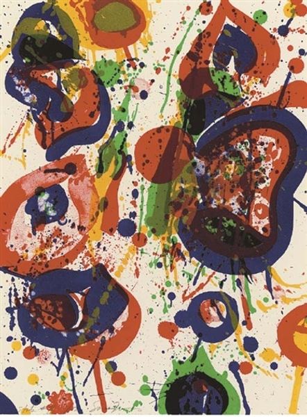
painting, acrylic-paint
abstract-expressionism
painting
acrylic-paint
paint stroke
abstraction
line
allover-painting
Copyright: 2012 Sam Francis Foundation, California / Artists Rights Society (ARS), NY
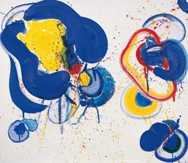
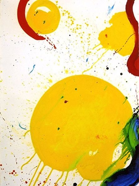
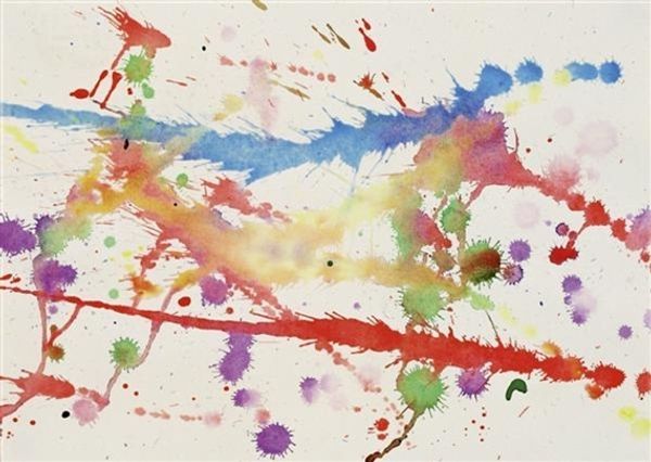
Editor: Here we have Sam Francis’s *Untitled* from 1964, rendered with acrylic paint. The splatters of color against the white feel so dynamic! What associations come to mind for you when you view this work? Curator: What strikes me is the way these distinct fields of color exist within the implied void of the white space. Notice how the red and blue seem grounded, substantial. Now consider how the other hues–yellow, green, even the splashes of violet–appear more ethereal, almost like afterimages. Editor: Afterimages…interesting. Is it the contrast that makes them read that way? Curator: In part, yes, the contrast certainly highlights the difference in perceived mass. But also consider what those primaries represent, both culturally and emotionally. The confident curve of blue and assertive red suggest established forces, even archetypes. While those flickering secondary colors hint at possibility, liminality... becoming. Think about Yves Klein using ultramarine blue or Rothko and his squares. How do artists assign certain cultural codes to the colours that they employ? Editor: I guess blue feels very different than, say, yellow. How does allover-painting as a strategy relate? It’s meant to avoid a focal point, right? Curator: Precisely. Yet even without a central subject, the composition evokes a feeling of narrative, perhaps even spiritual movement from known entities to uncharted potentiality. The “allover” technique can then function as a field, not of absence, but of generative energy. Editor: That changes my view. I initially saw chaos but now, that sense of potential resonates. It feels less random. Curator: Symbols don't stand still.
Comments
No comments
Be the first to comment and join the conversation on the ultimate creative platform.