print, paper, typography
# print
#
paper
#
text
#
typography
Dimensions: height 219 mm, width 308 mm
Copyright: Rijks Museum: Open Domain
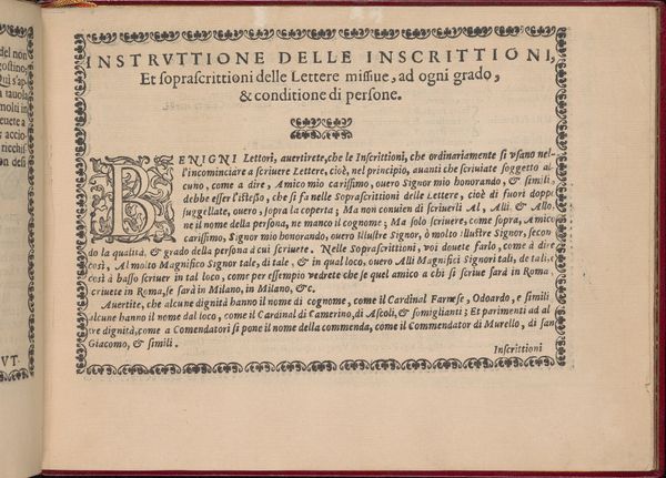
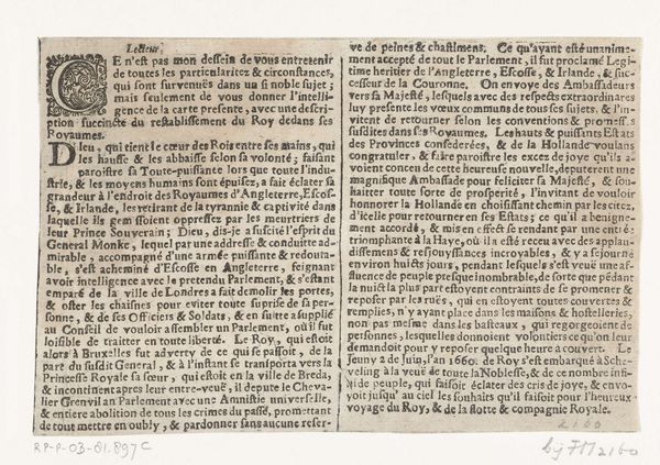
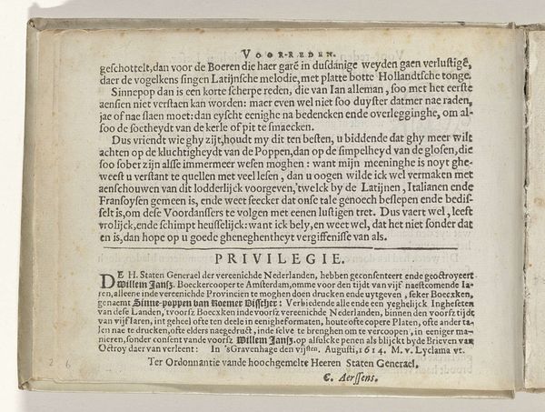
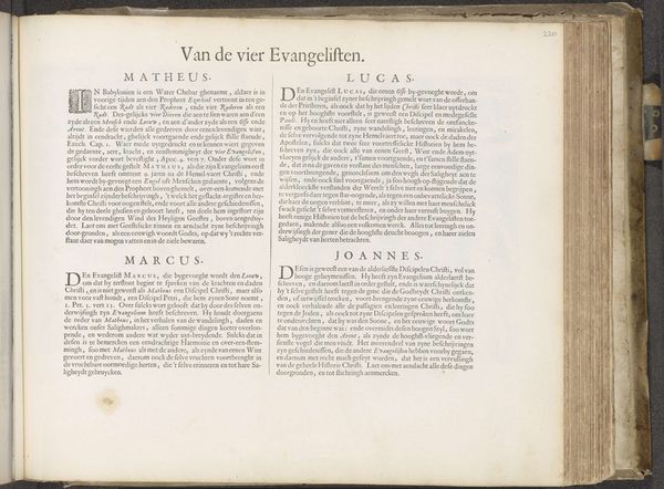
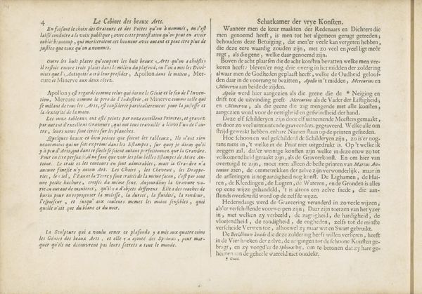
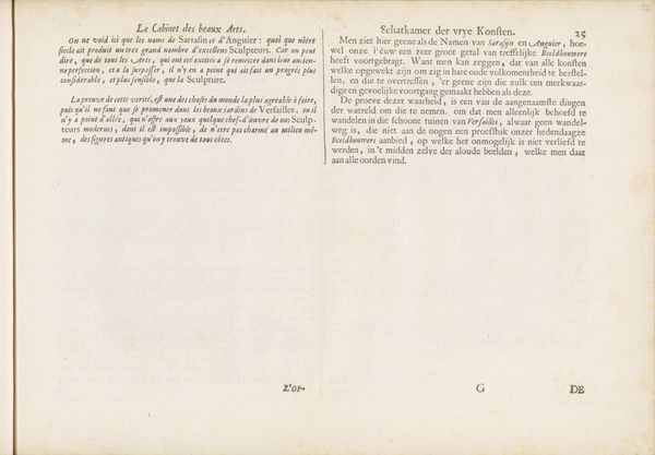
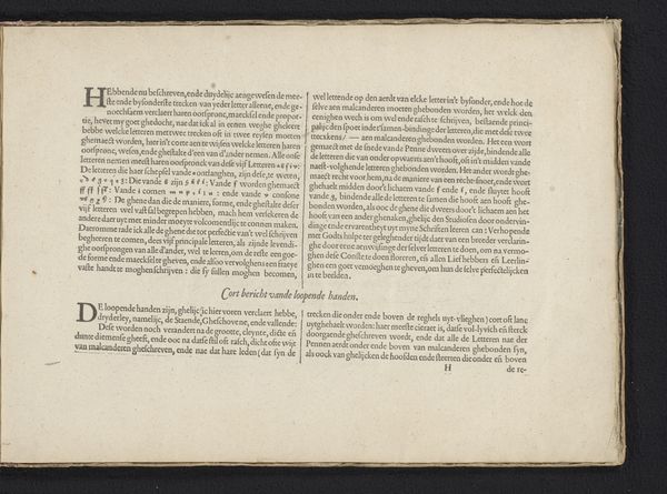
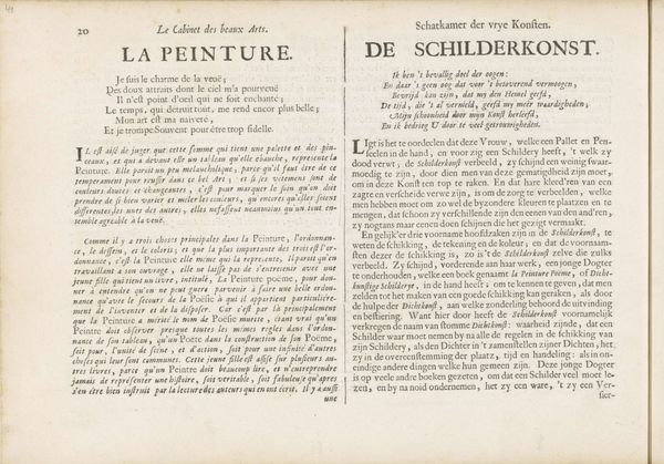
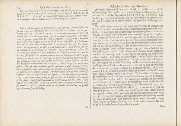
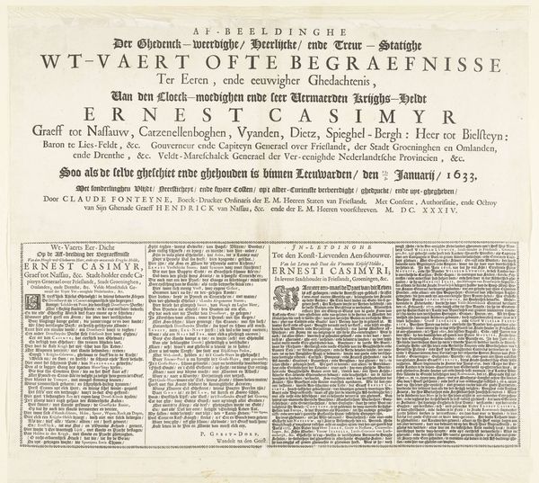
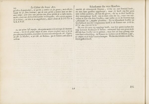
Editor: This print, titled "L'Eloquence" in French and "De Welsprekendheid" in Dutch, dates back to 1693. It’s striking how the typography becomes an art form in itself. The dense text creates a strong visual impression; almost like a tapestry woven with words. I’m curious to know how we should read the visual symbols embedded within this tapestry. What do you see in this piece? Curator: I see a conscious effort to weave language into the fabric of power, isn't it? Look how the artist positions “Eloquence” or "Welsprekendheid" as something divinely sanctioned. Consider the crowned figure alluded to in the Dutch text: it invokes both authority and something beyond human control. Doesn't that conjure classical allusions to muses or personifications of virtues? The letters themselves embody not just communication but enduring ideas. Editor: So, you're saying the artist uses the visual representation of text to suggest Eloquence is something powerful but almost otherworldly? It’s not just about being good at speaking, it’s something more. Curator: Exactly! Language holds immense power; images deepen its effect. How are we moved by an impassioned speech? The imagery suggests we grasp something beyond mere words – hints of divinity, wisdom accumulated through generations past. Isn’t that intriguing? Editor: That’s fascinating! I initially focused on the aesthetic appeal, but now I realize the symbols tap into something far deeper than just aesthetics. Thanks for sharing your insight. Curator: Likewise, your observations on typography were on point! We revealed together how meaning and design intertwine!
Comments
No comments
Be the first to comment and join the conversation on the ultimate creative platform.
