ceramic
#
natural stone pattern
#
art-nouveau
#
man-made pattern
#
ceramic
#
architecture influence
#
geometric pattern
#
traditional architecture
#
geometric
#
vertical pattern
#
pattern repetition
#
architectural
#
decorative-art
#
layered pattern
#
combined pattern
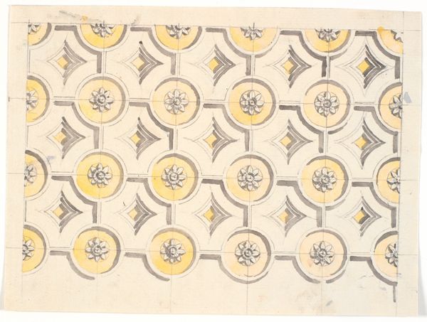
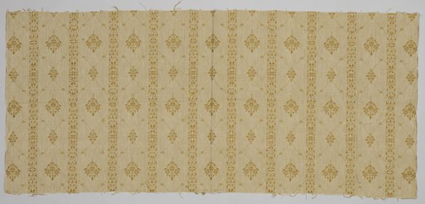
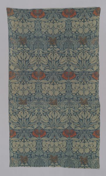
Dimensions: height 273.5 cm, width 79.5 cm, height 16 cm, width 16 cm, height 8 cm, width 16 cm, height 15 cm, width 2.5 cm
Copyright: Rijks Museum: Open Domain
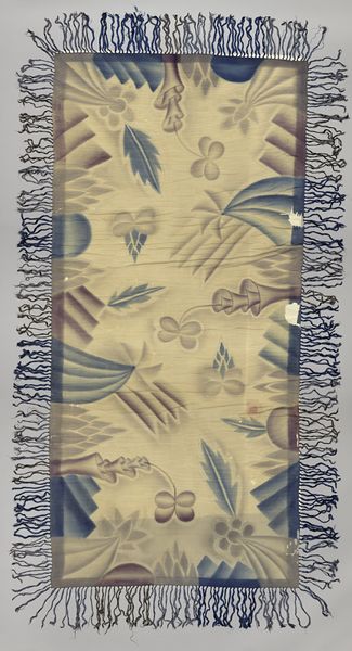
Curator: Today we're examining "Tegeltableau met patroon van gestileerde bloemen," a ceramic tile panel created around 1900 by the firm of Joost Thooft & Labouchère. What are your initial observations? Editor: My first thought is, 'domestic aspirations'. The repetition feels very soothing, but also speaks to me of class. Was this affordable for all layers of society, or a luxury of the wealthy to signal taste and refinement during this period? Curator: Intriguing. Let's break down the design itself. The panel is dominated by vertical floral motifs. The linear precision of the rendering combined with the subdued color palette evokes a sense of measured elegance. Notice the interplay of positive and negative space, particularly within the floral heads themselves. Editor: Right, that controlled elegance resonates with the Art Nouveau movement’s embrace of stylized nature. It attempts to wrestle the chaos of nature into a controllable design. Looking at the repetition, I also think of the rise of industrial production, which provided not only new materials but also reflected how domestic lives were becoming standardized during this era. Does this pattern imply a certain restrictive vision of beauty for women, particularly those occupying domestic roles? Curator: An interesting question. Focusing solely on form, I see in that controlled repetition a delicate negotiation between the rigidity of industrial design and the organic inspiration. The stylization speaks to an intellectual pursuit of essential form. Editor: It is more than an aesthetic choice, though. These choices normalize cultural ideals. Who was granted access to beauty, who was denied? The stylized flower – the choice of ceramic tile, even - must be unpacked from the lens of access and power. Curator: These are, of course, fundamental and necessary questions to ask. Perhaps through continued formal analysis, we can address issues of function alongside discussions of gender and class. Editor: Yes, both of our perspectives are needed. Seeing it as a series of choices made by specific humans to serve a society can help in making art more equitable.
Comments
No comments
Be the first to comment and join the conversation on the ultimate creative platform.
More like this