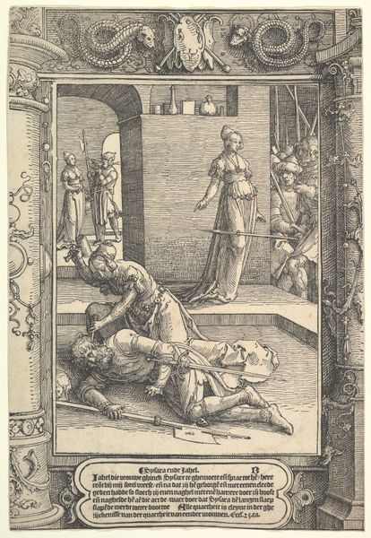
drawing, ink
#
drawing
#
narrative-art
#
baroque
#
figuration
#
ink
#
chiaroscuro
#
history-painting
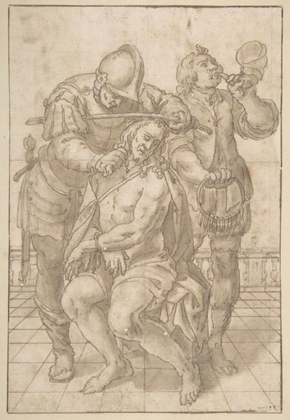
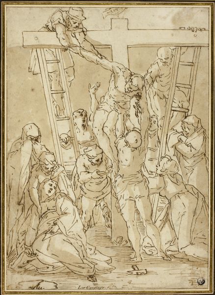
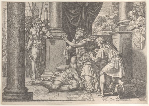
Dimensions: 190 mm (height) x 129 mm (width) (bladmaal)
Editor: This drawing, "The Mocking of Christ," made sometime between 1656 and 1704, is rendered in ink. It’s a fairly small piece, but the scene it depicts feels incredibly intense, mostly due to the dramatic chiaroscuro effects. How would you interpret the formal elements at play here? Curator: Indeed. Note how the anonymous artist employs line and shading to create volume and tension. The figures are defined not by smooth contours but by a dynamic interplay of light and shadow. Consider, too, the composition itself. Christ is centrally located, yet he's visually overpowered by the figures surrounding him, an effect achieved through the use of line and varying tonal densities. The column behind adds a certain gravitas. Editor: It almost feels claustrophobic, the way the figures are arranged so close together. Does that contribute to the emotional impact? Curator: Precisely. The density of the linework in the immediate foreground focuses the viewer's eye on the point of the central interaction, thus amplifying the emotional charge of the composition. The overall effect is heightened by the relatively simple architectural elements placed at the edge of the composition that, tonally speaking, contain the chaotic energy of the figures in the centre. Are there certain semiotic or structural ideas that you are thinking about as well? Editor: Well, this focus on line and the play of light helps to show how inherent structures of power, violence, and artistic construction intersect. I hadn't thought of that before. Curator: Exactly. This piece provides us with insight into art making within that cultural time frame. Editor: Looking at the artwork like this certainly shifts my perspective. Thank you.
Comments
No comments
Be the first to comment and join the conversation on the ultimate creative platform.
More like this