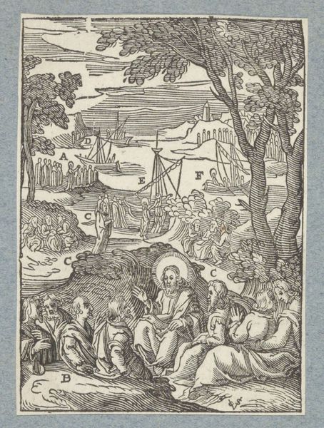
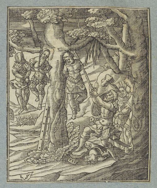
print, engraving
narrative-art
baroque
figuration
history-painting
engraving
Dimensions: height 103 mm, width 74 mm
Copyright: Rijks Museum: Open Domain
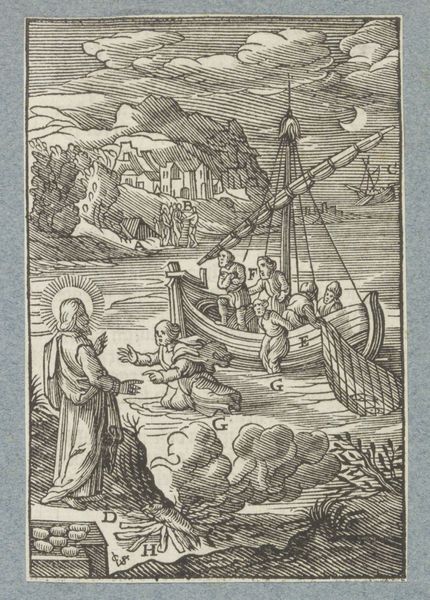
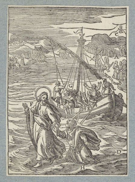
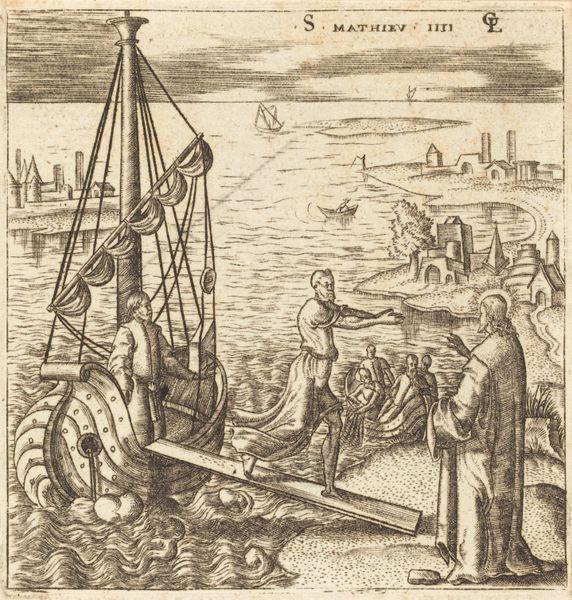
Editor: We're looking at "The Miraculous Catch of Fish," a 1629 engraving by Christoffel van Sichem II, currently held in the Rijksmuseum. It’s quite intricate; a complex scene packed with figures and vessels. The line work is striking given the relatively small scale, creating quite a dynamic sense of movement on the water. How do you interpret the composition and use of line in this engraving? Curator: The dynamism you observe arises primarily from the contrasting directions of lines. Note the orthogonals of the boat masts pointing upwards are offset by the curved horizontals of the waves and figures, generating visual tension. Van Sichem masterfully uses hatching to model forms, achieving tonal variation, drawing attention to the narrative’s key focal point: the interaction on the boat where Jesus appears. Do you notice how the lines become denser there? Editor: I do. It makes Jesus the clear center of attention despite the activity around him. Is this typical of Baroque printmaking, this kind of directed focus? Curator: It's representative. The Baroque often emphasizes drama through strong contrasts. Van Sichem strategically organizes the figures along the water, guiding the viewer's eye towards Christ, then along the shore toward the city beyond, using lines and shapes, and also creating a clear path of narration across the composition. How do you react to that compositional strategy? Editor: It does a wonderful job illustrating this key story. Thank you for pointing out how form can underscore function and content in Baroque art. I learned so much by understanding Van Sichem's conscious line work. Curator: The work has an accomplished execution for such a small print. A fruitful visual investigation.
Comments
No comments
Be the first to comment and join the conversation on the ultimate creative platform.