drawing, ink
#
abstract-expressionism
#
drawing
#
form
#
ink
#
abstraction
#
line
#
monochrome
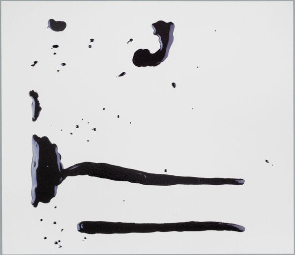
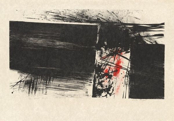
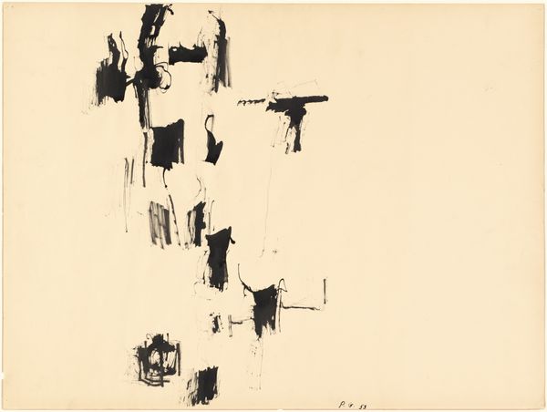
Dimensions: 13.3 x 17.5 cm
Copyright: Julius Bissier,Fair Use
Julius Bissier made this small ink painting, 8.7.58, on paper in 1958. It’s like he's using the bare minimum: a muted palette of blacks, grays, and whites, and the simplest, most direct marks. It gives the impression of a kind of spontaneous meditation on the act of image making itself. The surface of the paper is mostly bare, allowing the material qualities of the ink to really stand out. Look at the large rectangular form on the left. Notice the way the ink bleeds and pools, creating subtle tonal variations. The textures gives depth without being overly descriptive. Those splatters near the top right seem almost accidental. But it’s like he’s saying something about the beauty of imperfection, embracing the unexpected. Bissier's work reminds me a little of Agnes Martin, both in their quiet, contemplative nature and their exploration of subtle variations within a limited range. It suggests a broader conversation about abstraction, simplicity, and the power of suggestion in art.
Comments
No comments
Be the first to comment and join the conversation on the ultimate creative platform.
More like this