print, engraving
#
portrait
#
baroque
# print
#
pen sketch
#
pencil sketch
#
figuration
#
history-painting
#
engraving
Dimensions: height 105 mm, width 156 mm, height 117 mm, width 161 mm
Copyright: Rijks Museum: Open Domain
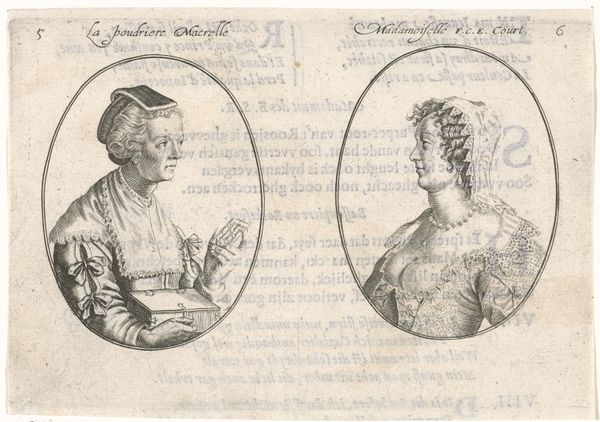
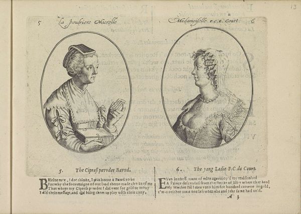
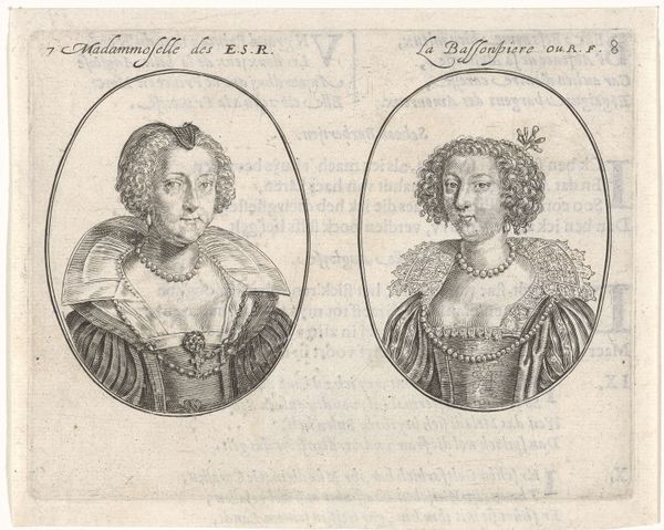
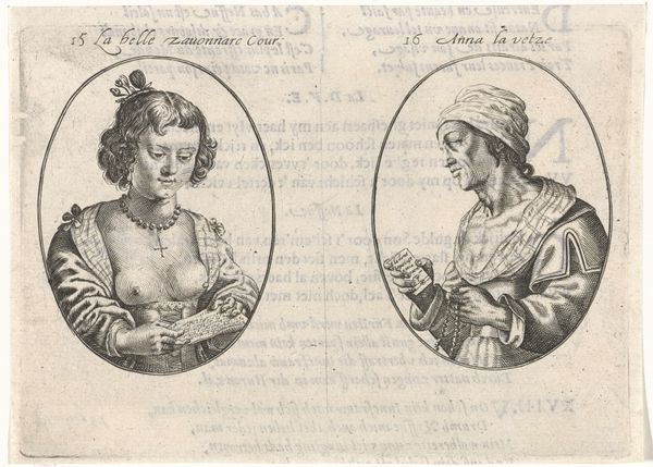
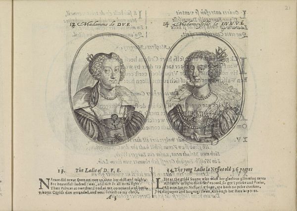
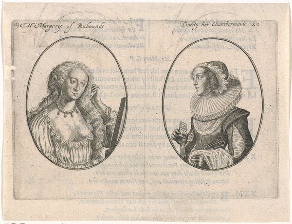
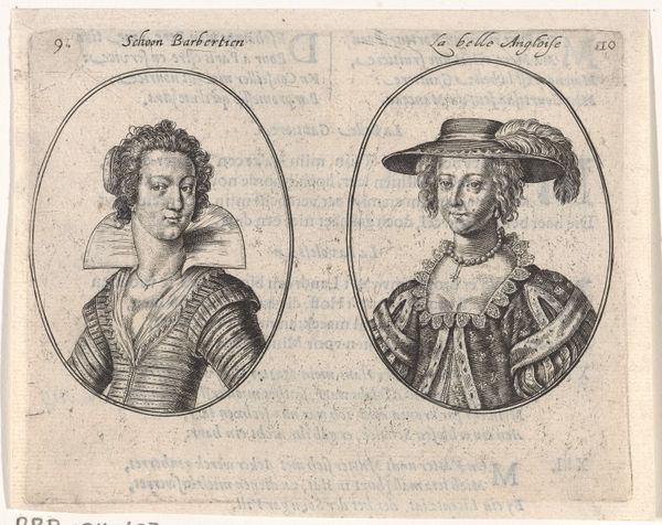
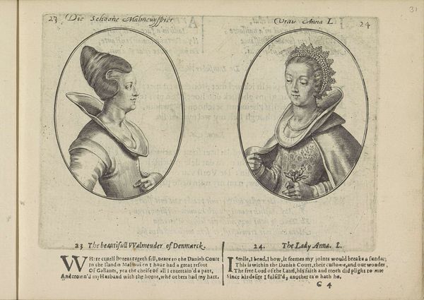
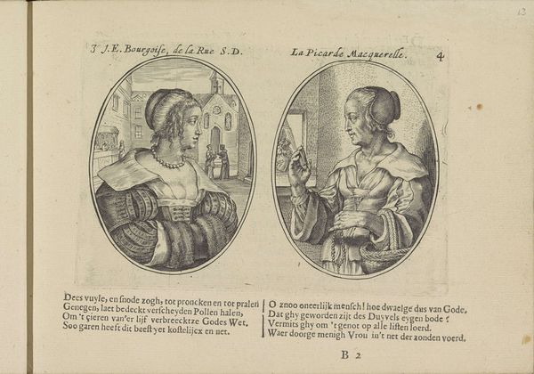
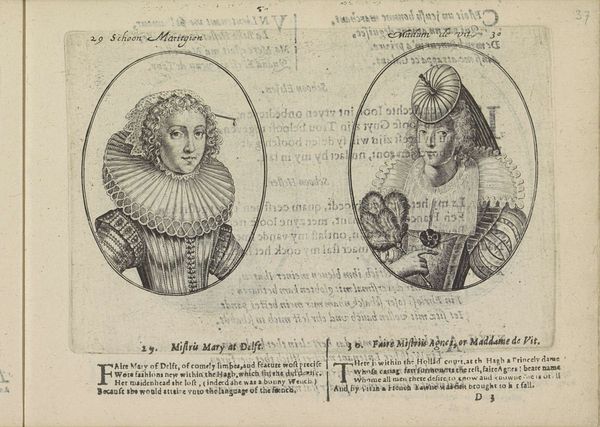
Editor: This print, "Portretten van twee courtisanes," from around 1630 by Crispijn van de Passe the Younger, is quite striking. I’m fascinated by the contrasting depictions, set within circular frames. What stands out to you most in terms of form and composition? Curator: The stark linear quality of the engraving commands attention, doesn't it? Note the artist’s reliance on line to delineate form and texture. Look closely: How does the varying density and direction of the lines create a sense of volume and shadow? It's not about surface realism; instead, it prioritizes graphic clarity. Editor: Yes, the lines are very deliberate. What about the composition itself, placing these two portraits side by side? What effect does that choice achieve? Curator: Precisely. It compels us to read them in relation to each other, despite the very different ways they are positioned. The use of the oval frames against the larger rectangular page creates a tension – a dialogue between containment and expansion. What are your thoughts on the empty spaces and textual elements that accompany the portraits? Do they enhance or detract from the visual impact, in your view? Editor: I see what you mean about the tension. At first, the text was a little distracting. However, the text and ornament of the broader space contrast with the curves and lines of the sitters' images to me, in a way I like. Thank you for pointing out the subtleties. I now notice how everything interacts and complements one another. Curator: A fresh viewing, indeed! It’s in those structural relationships where the essence of the artwork resides.
Comments
No comments
Be the first to comment and join the conversation on the ultimate creative platform.
More like this