Dimensions: height 150 mm, width 178 mm
Copyright: Rijks Museum: Open Domain
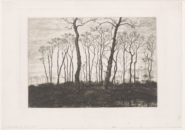
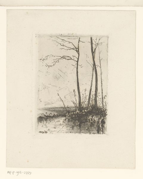
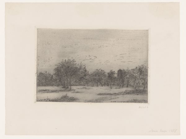
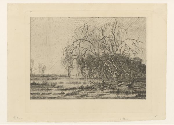
Editor: This etching, “Bomen aan de waterkant in Valkeveen” or "Trees on the Waterfront in Valkeveen," was created around 1913 by Willem Witsen, and it's currently held at the Rijksmuseum. I’m really struck by the stark contrast between the dark trees and the almost ethereal lightness of the water and sky. It's so evocative. What strikes you most when you look at this piece? Curator: It is indeed evocative. Immediately, the emphasis on line becomes apparent. Notice how Witsen uses the density and direction of etched lines to define form and create value. The bare trees, meticulously rendered, draw the eye upward. How does the artist’s creation of depth using line, shadow, and the picture plane affect your perception? Editor: It definitely feels like he’s creating depth, but with minimal tools. The dark lines of the trees contrast with the lighter sky to make a foreground and background. Curator: Precisely. It seems the landscape tradition of framing nature for aesthetic contemplation is being observed here. However, this piece appears less interested in accurate spatial representation and more with evoking mood, which can be said of impressionistic aesthetics. Does that strike you as intentional, even if he does still successfully generate depth? Editor: I think so. There’s a feeling more than a clear depiction. It’s like he’s inviting you into a space, but it's one filtered through a personal lens. Curator: Indeed. Also, what compositional tools do you observe within this work which leads to that interpretation? Editor: The repetition of verticals in the trees draws my eye, but also that light source on the horizon—even that line feels repeated across the image. Curator: Precisely! I believe we can agree on Witsen's masterful interplay between line and light. I am now noticing more structural relationships at play in this fascinating print. Editor: I agree. I hadn’t noticed the emphasis on lines initially but observing its structure does make it stand out.
Comments
No comments
Be the first to comment and join the conversation on the ultimate creative platform.
More like this