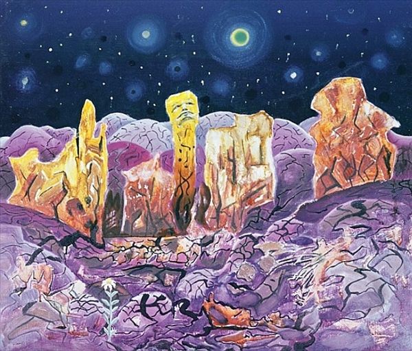
watercolor
#
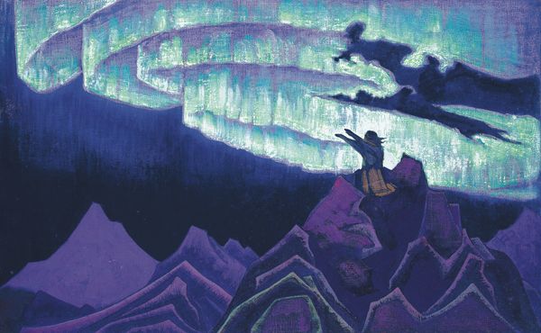
fantasy art
#
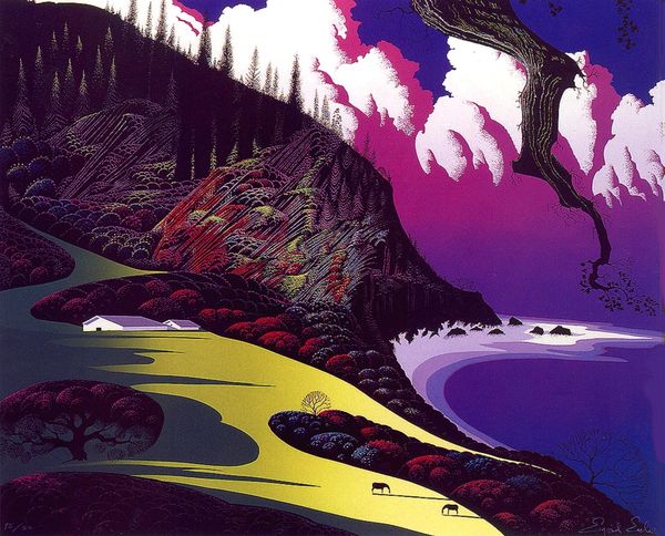
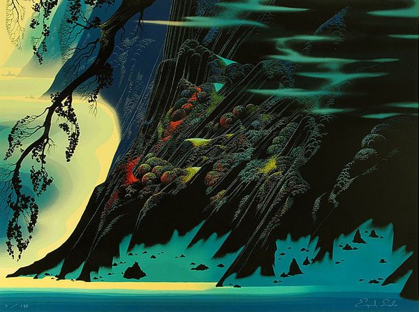
landscape
#
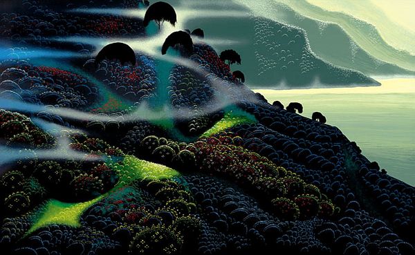
fantasy-art
#
watercolor
#
cityscape
#
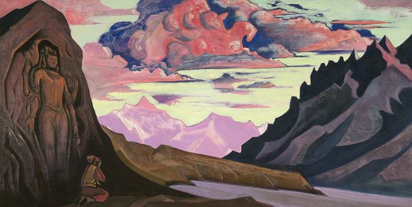
watercolour illustration
#
watercolor
Copyright: Modern Artists: Artvee
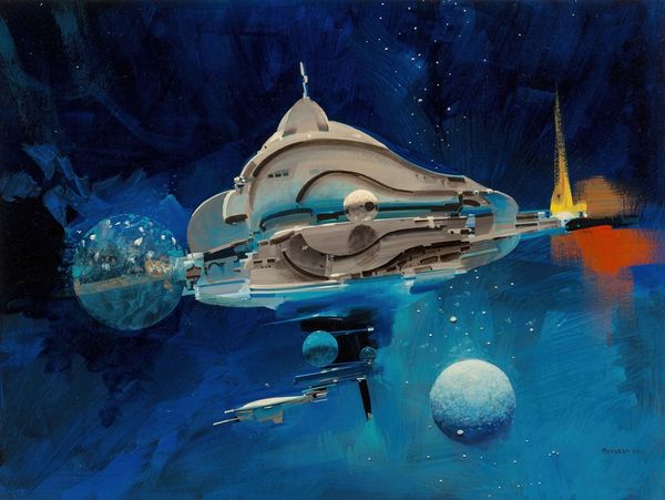
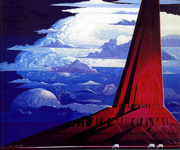
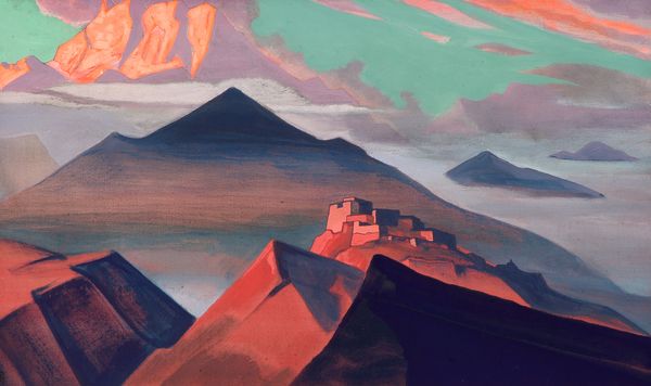
Curator: Good morning. Today, we’ll be discussing Greg Hildebrandt’s 1982 watercolor illustration, "Krull Black Fortress," concept art for the film "Dragons of Krull." Editor: Wow. My first impression is that this looks like somewhere I would both desperately want to visit, and equally fear. It’s got a definite "other-worldly vacation home for the dark lord" vibe, wouldn't you agree? Curator: Indeed. The structure dominates, conforming almost organically to the craggy rock beneath. This juxtaposition, the organic against the geometric, suggests an interesting power dynamic at play in the film’s world-building. Observe the celestial bodies. Editor: Yes! Two purple, ringed planets presiding over everything. I'm immediately thinking of narrative weight. Each planet likely represents some dueling cosmic force, each with a potential claim to the "Black Fortress," that you pointed out seems to naturally erupt out of the landscape. The water almost glows. Curator: Precisely. The watercolour medium allows Hildebrandt to exploit the fluidity and layering of tones. Note how the hues transition seamlessly. This softens what would otherwise be a severely stark, even menacing, fortress, especially with the dragon head detail dominating the highest point. It is undeniably menacing though, despite the "softness." Editor: Absolutely! It's that delicious tension. It makes you wonder who built this, and more importantly, why they felt the need to install a massive dragon skull on top! It does suggest hierarchy, power, dominion... but the details! There are flickering lights within the structure as though somebody’s home. And even with its darker tones and clear "villain" pedigree, it looks almost...peaceful. Curator: That peace, or the illusion of it, may stem from the balanced composition and limited, analogous color scheme, where violet hues dominate and foster a sense of aesthetic cohesion. A dark fairy tale still wants you to dream in it, in a sense. Editor: I think this illustration definitely embodies that kind of dark fantasy aesthetic so popular in the eighties. You know, beautiful but dangerous, magical but grounded... the kind of setting that made me want to pick up a sword and search for adventure! I like how even within the context of promoting something else, the artwork has its own impact. Curator: I concur. The pre-production still offers such valuable insight, even decades after the film's release, proving how vital formal elements can shape enduring imaginative space.
Comments
No comments
Be the first to comment and join the conversation on the ultimate creative platform.
More like this