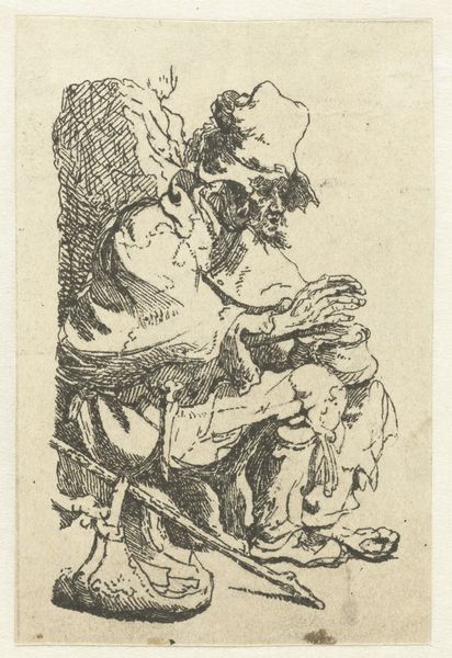
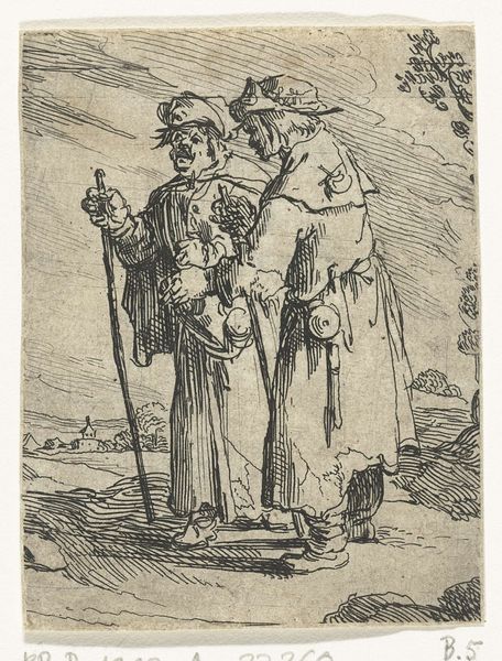
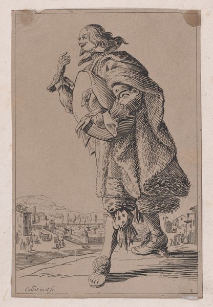
drawing, print, etching, paper, ink
#
portrait
#
drawing
#
baroque
# print
#
etching
#
paper
#
ink
#
genre-painting
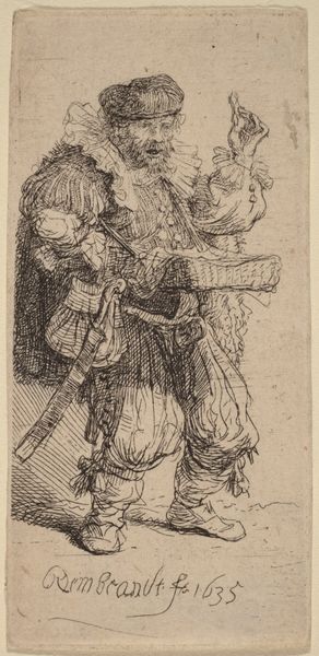
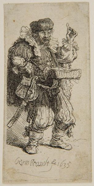
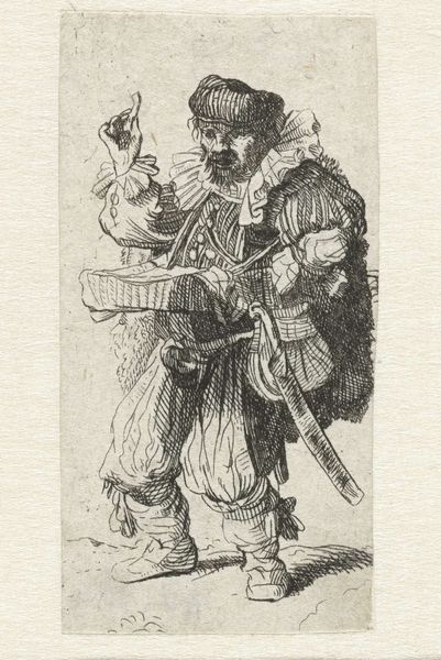
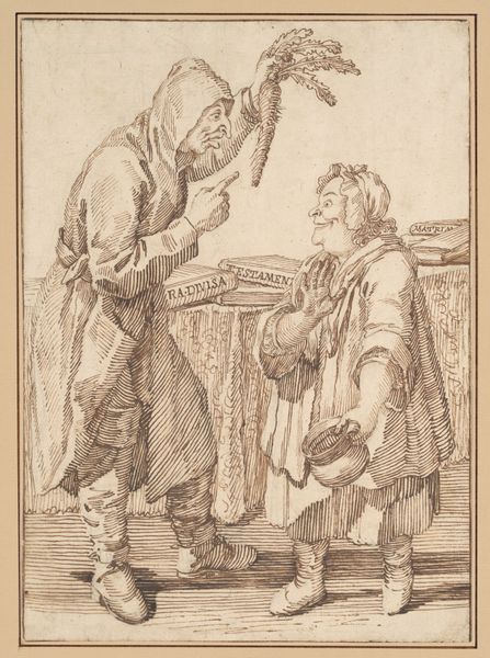
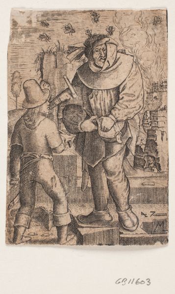
Dimensions: 73 × 37 mm (plate); 74 × 38 mm (sheet)
Copyright: Public Domain
Editor: Here we have Rembrandt van Rijn’s etching, "The Quacksalver," created in 1635. The crisp lines forming this figure really give a sense of character; it's almost theatrical. What do you see when you look at the work? Curator: Formally, the success of this print resides in its delicate, yet forceful use of line. Notice how the density of hatching creates depth, almost mimicking chiaroscuro within the confines of etching. Do you see how the varied line weights add dimensionality? Editor: Yes, absolutely! Especially in the figure’s clothing; you can really feel the fabric. Is the lightness also strategically considered? Curator: Precisely. The open areas serve as a foil to the heavily worked sections, enhancing the three-dimensionality. Consider also how Rembrandt has placed the signature at the lower-left, subtly yet undeniably anchoring the composition. How does that placement influence your perception? Editor: It balances it, keeping the figure grounded, even with that hand raised up high! Curator: Exactly. It redirects the eye, preventing the upward gesture from unbalancing the visual field. We can observe in "The Quacksalver" how Rembrandt is exploring how compositional strategies guide viewers. Editor: I hadn't thought about it like that before – seeing it as less about subject and more about the visual components themselves. Thanks! Curator: My pleasure. Attending to such aspects reveals a more nuanced reading, stripping the image to its basic structural elements and exposing a complex understanding of semiotics.
Comments
No comments
Be the first to comment and join the conversation on the ultimate creative platform.
More like this