drawing, ornament, print
#
irregular pattern
#
drawing
#
natural stone pattern
#
aged paper
#
ornament
#
baroque
# print
#
geometric pattern
#
subtle pattern
#
repetitive shape and pattern
#
geometric
#
repetition of pattern
#
vertical pattern
#
men
#
pattern repetition
#
layered pattern
Dimensions: sheet: 8 5/8 x 9 1/2 in. (21.8 x 24.1 cm)
Copyright: Public Domain
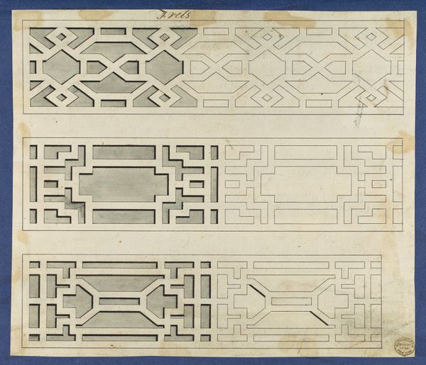
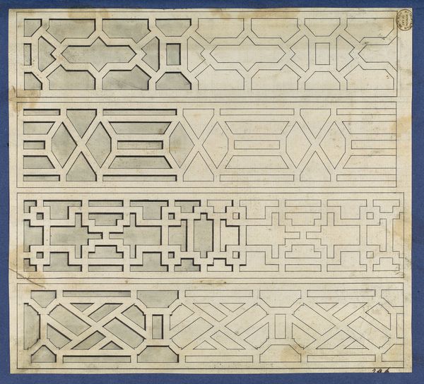
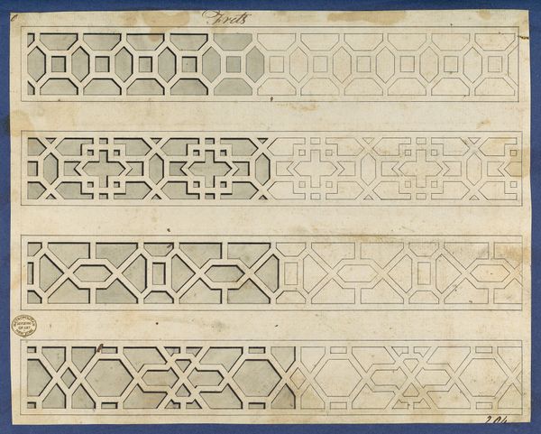
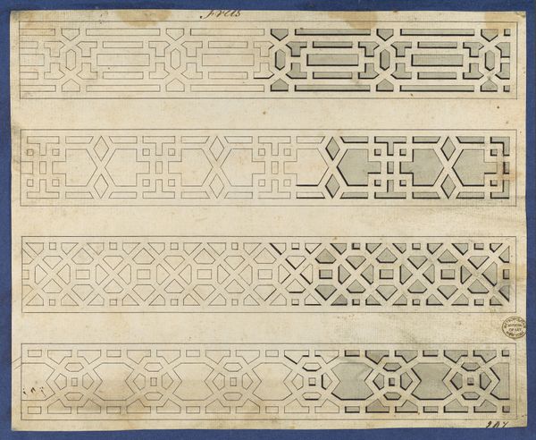
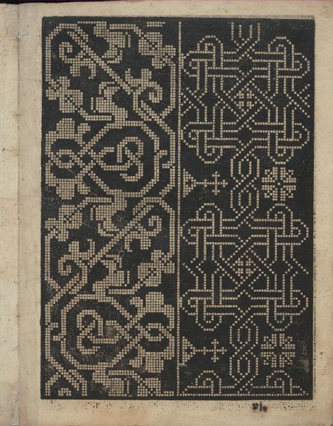
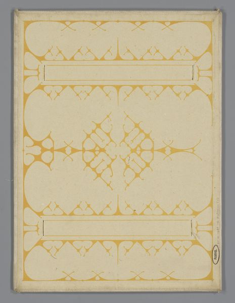
Curator: Let's turn our attention to this page from Thomas Chippendale’s *Chippendale Drawings, Vol. II*, specifically the “Frets” design, dating back to 1754. Editor: Whoa, instantly getting some Wes Anderson vibes! This drawing just looks so precise and… well, kind of hypnotizing with all those repetitive shapes. A bit like a puzzle, honestly. Curator: "Frets," as decorative elements, held immense social significance. Chippendale’s designs became synonymous with sophisticated domesticity, symbolizing wealth and status for the emerging middle class in England. Consider how architectural spaces were gendered—public versus private, masculine versus feminine—and how design elements like these served to delineate such spaces. Editor: Oh, for sure. I mean, picture this as part of some posh living room situation, right? It’s not just decoration; it's totally communicating something. But, looking at the details, it feels a little severe too. Like, these patterns almost look like miniature labyrinths. Curator: Indeed. Chippendale skillfully blended Baroque and Rococo styles with emerging Neoclassical tastes. The geometric patterns were, at the time, cutting-edge design statements meant to evoke a sense of refined order. Think of how colonial trade routes impacted the availability of exotic woods and materials. This fretwork symbolizes not just luxury but the power structures enabling that luxury. Editor: Power structures hidden in plain sight...literally! The composition here is super interesting, too. Like, why three distinct fret patterns? It almost feels like he's experimenting with different moods, each strip having its own personality. Curator: It is likely that the format was chosen for display and selection by patrons of Chippendale’s firm. The print offered various interpretations of the ‘fret’, including one with distinct geometric influences reflecting, as you say, three ‘moods’ for prospective clients. Editor: I love how something that looks so simple on the surface can be this whole can of sociopolitical worms. Next time I'm redecorating, I'll definitely give this more thought. Curator: Absolutely. Understanding art means grappling with its implications for gender, race, class, and power. Editor: Right? Maybe this print is like a secret portal to all of that! I definitely see more than just some pretty patterns now.
Comments
No comments
Be the first to comment and join the conversation on the ultimate creative platform.
More like this