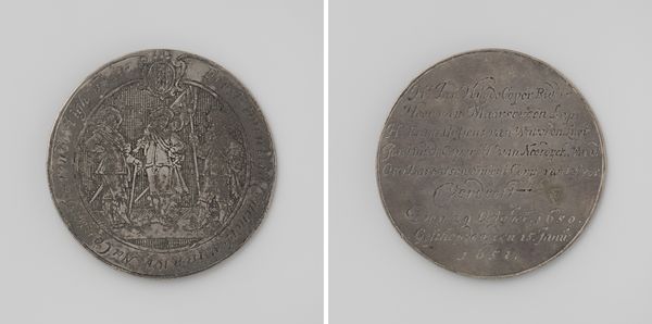
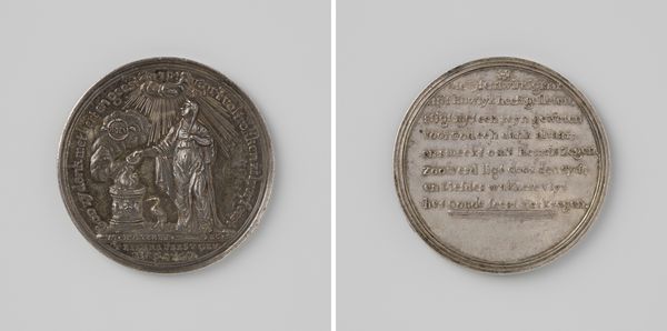
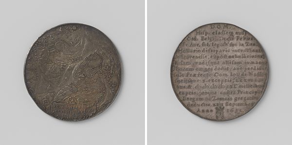
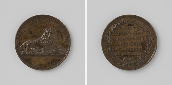
Gezantschap van Johan Huydecoper, heer van Maarsseveen, naar de keurvorst van Brandenburg bij gelegenheid van het peterschap van Karel Emilius 1655
0:00
0:00
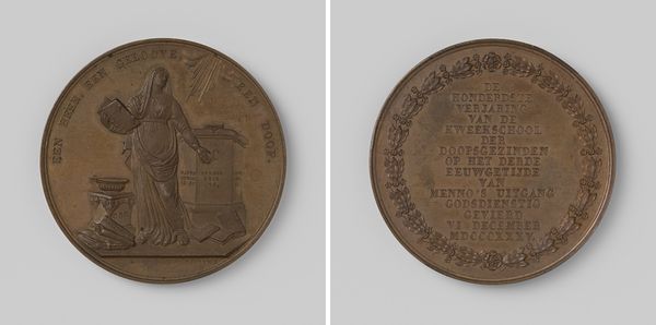
metal, relief, engraving
#
baroque
#
metal
#
relief
#
engraving
Dimensions: diameter 6.3 cm, weight 73.16 gr
Copyright: Rijks Museum: Open Domain
Curator: Well, here we have the "Gezantschap van Johan Huydecoper, heer van Maarsseveen, naar de keurvorst van Brandenburg bij gelegenheid van het peterschap van Karel Emilius", created in 1655. It's an engraved metal relief. What strikes you first about it? Editor: It feels almost like a historical snapshot in miniature, doesn't it? I mean, it's a coin! It feels kind of Baroque to me, with the level of detail. But tell me, what do you think was the overall message that they wanted to express through the coin and this kind of engraving? Curator: Oh, absolutely. This piece speaks of power, legacy, and good PR, all wrapped in a tidy metal disc. Notice how the crest dominates one side – those lions practically shout "prestige," don't they? It’s not just about Johan Huydecoper's visit; it’s immortalizing a connection to a rising power in Brandenburg. I wonder what those present felt receiving a coin with the mentioned crest? Editor: Definitely makes you wonder who had the chance to even hold one. So, it’s essentially a very elaborate thank-you card, Dutch-style? Or even a proto-press release? Curator: Precisely! Except, instead of hitting "send," they struck metal. It’s a savvy move because gifting the artwork can solidify alliances, maybe subtly hint at ambitions and let everyone else know that Johan is to be remembered in History books! What side of it feels the most impressive to you? The Crest, or the Text on the other side? Editor: You know, the crest initially caught my eye. But thinking about it, that inscription on the reverse, laying out all the facts and connections, feels equally crucial. Almost like the small print in a major deal! Curator: Ha! Perfect analogy! So it is good press wrapped with pride! Editor: Okay, I will never look at Baroque coins the same way. Definitely changes my view on portraiture in general. Curator: Same here. There’s so much to unearth! It just adds to the wonder of seeing history compressed into a handheld piece.
Comments
No comments
Be the first to comment and join the conversation on the ultimate creative platform.
More like this