Dimensions: height 206 mm, width 153 mm
Copyright: Rijks Museum: Open Domain
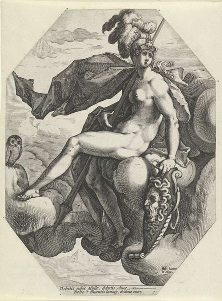
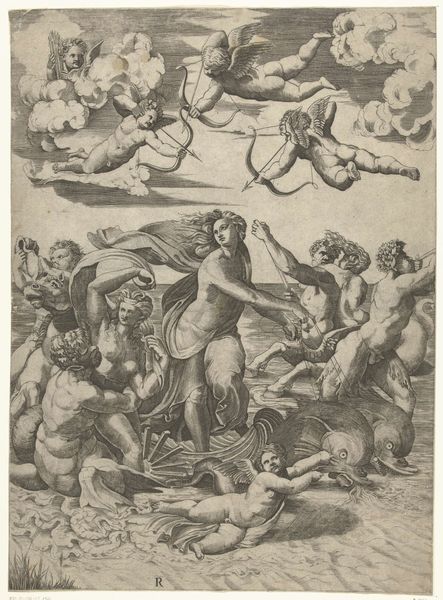
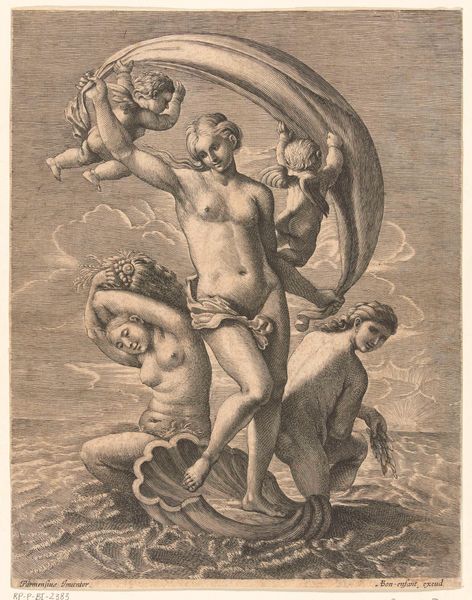
Editor: So, this is Jacob Matham's "Venus," an engraving from around 1585. I’m struck by how detailed the textures are, especially in the clouds and Venus’s drapery. It seems to hover between delicacy and intensity, which I wouldn’t expect from an engraving. What can you tell me about it? Curator: Let's consider Matham’s process. Engraving, especially with this level of detail, requires tremendous labor. Each line is carefully etched into the copper plate, making the materiality of the plate central to the image we see. Notice how the density of lines affects light and shadow. Where do you think the engraver would have spent most time? Editor: Probably on Venus herself, given her prominent position, but the density of the cloud lines also seems quite high. Is this all simply aesthetic, or does the physical effort have a broader context? Curator: Good question. The market for prints in the late 16th century was exploding. Prints democratized images. A print like this made classical themes and art accessible to a wider audience than painting or sculpture allowed. Think about who might purchase such a work? Editor: Perhaps those aspiring to aristocratic taste but lacking the funds for original paintings? So, buying an image of Venus becomes a form of consumption and a status symbol in itself? Curator: Exactly! Furthermore, prints were often collaborative. Matham would have relied on assistants. So we should see "Venus" not just as a work of art but also a product of workshops and markets. Also notice, does Venus look comfortable on that cloud? Editor: Not particularly, she almost looks sad. Perhaps that makes her more relatable to those who buy the print? Thanks for showing me how labor and access relate to art production.
Comments
No comments
Be the first to comment and join the conversation on the ultimate creative platform.