drawing, print, ink, engraving
#
portrait
#
drawing
#
neoclacissism
#
blue ink drawing
# print
#
ink
#
cityscape
#
engraving
Dimensions: height 130 mm, width 174 mm
Copyright: Rijks Museum: Open Domain
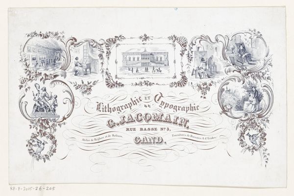
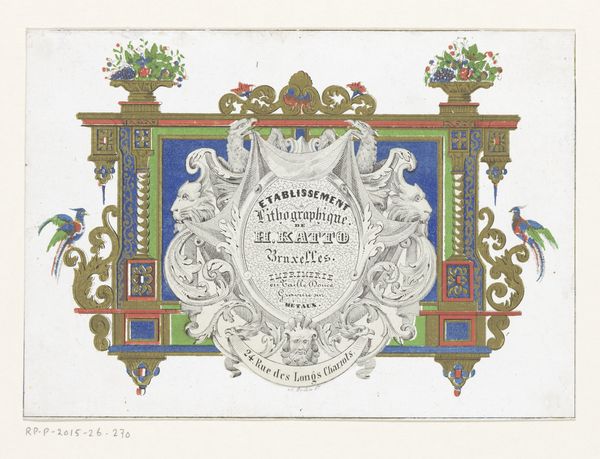
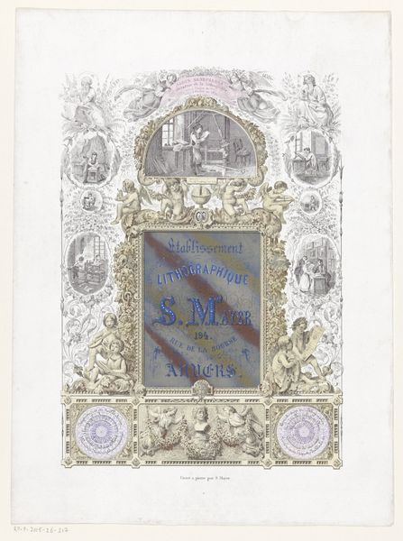
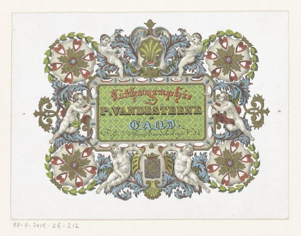
Pierre Vande Steene, a printer in Ghent, created this calling card, using an unknown medium. The card exemplifies the late 19th-century commercial aesthetic, embedding the name and trade within a visual language that spoke to status and taste. Notice the cherubs and elaborate ornamentation—these are not just decorative. They link the printer's services to a longer, more valued artistic tradition. The depiction of Ghent also roots Vande Steene's business within the local community, appealing to civic pride. Ghent was then a bustling industrial city in Belgium, experiencing rapid social and economic change. A business card like this wasn't just informational, it signaled an alignment with progress. To fully understand this card, we'd need to delve into archives of printing history, exploring the conventions and aspirations of the time. The visual style tells us much about the society and institutions in which Vande Steene operated.
Comments
No comments
Be the first to comment and join the conversation on the ultimate creative platform.
