Copyright: Public Domain: Artvee
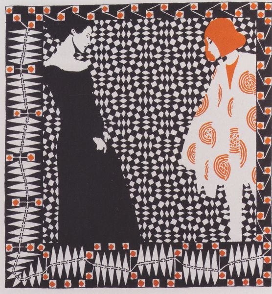
Curator: Ah, "Inland Printer," a poster created in 1895 by Will Bradley. It's an exemplary piece of graphic art. I see the influence of Art Nouveau and the decorative arts, especially in the curvilinear forms and stylized figures. Editor: Immediately striking. The juxtaposition of the red and white figures against that complex, dark backdrop really pops. There's something almost haunting about it, despite the Christmas greeting. Curator: I find that contrast quite telling. Bradley was working in a time of rapid industrialization and urbanization. This piece reflects both the allure and anxieties of modernity. The "Inland Printer" publication promoted the printing trade. I believe this poster makes a statement about gendered roles in the industry, don't you think? Who are those women, cloaked, isolated from each other? Editor: Perhaps, but structurally, consider how the artist used asymmetry. The two figures are balanced yet distinct, each echoing and opposing the other. And what about the decorative background? It's a flattening of pictorial space, directing attention to surface and pattern, it works brilliantly. Curator: Well, yes, but those shapes are also loaded! Those swirls feel organic, yet also manufactured. The women aren’t just decorative, they reflect an era that fetishized feminine purity, domesticity, even as women were entering the workforce. This advertisement speaks to the paradox of opportunity and restriction experienced by turn-of-the-century women. It's also about class: The figure on the right might be viewed through the lense of disability, as it might depict blindness, but who can actually tell? Editor: I admit there's a disquieting ambiguity at play. But what fascinates me is how these flat shapes combine to generate such an intense, almost ethereal presence. See, the line becomes everything in the rendering of the robes—there is form and feeling simply in silhouette. It’s deceptively simple! Curator: Indeed, these design choices, seemingly superficial, engage with real issues about gender, labor and visual representation. It invites reflection on how we idealize certain archetypes while masking others from view. Editor: I can appreciate that reading of the advertisement and the way the interplay between form and context adds new layers to understanding, perhaps now I also find that uneasiness when thinking about that isolated form of those people! Curator: Ultimately, it’s a work of sophisticated design with profound insights on modern culture and inequality. Editor: A masterful study in balance, a demonstration of the symbolic charge inherent in elemental shapes and color.
Comments
No comments
Be the first to comment and join the conversation on the ultimate creative platform.
More like this