drawing, ink, pen
#
drawing
#
comic strip sketch
#
art-nouveau
#
old engraving style
#
cartoon sketch
#
figuration
#
personal sketchbook
#
ink
#
ink drawing experimentation
#
pen-ink sketch
#
line
#
pen work
#
sketchbook drawing
#
pen
#
storyboard and sketchbook work
#
sketchbook art
Dimensions: height 253 mm, width 157 mm
Copyright: Rijks Museum: Open Domain
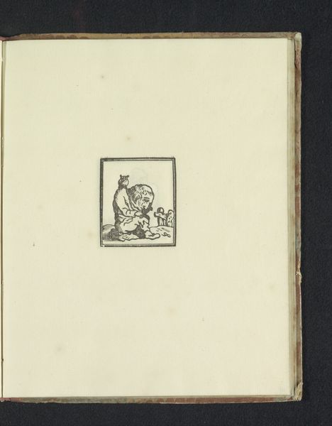
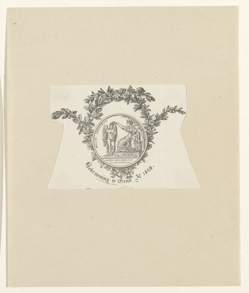
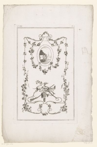
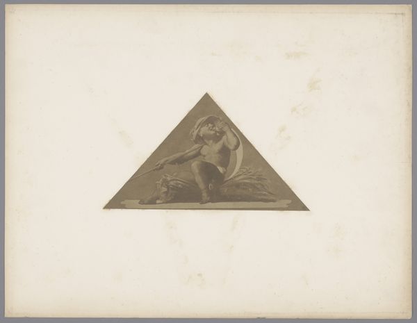
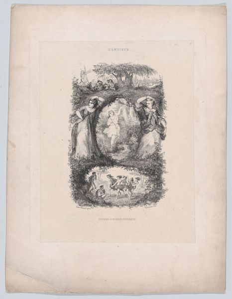
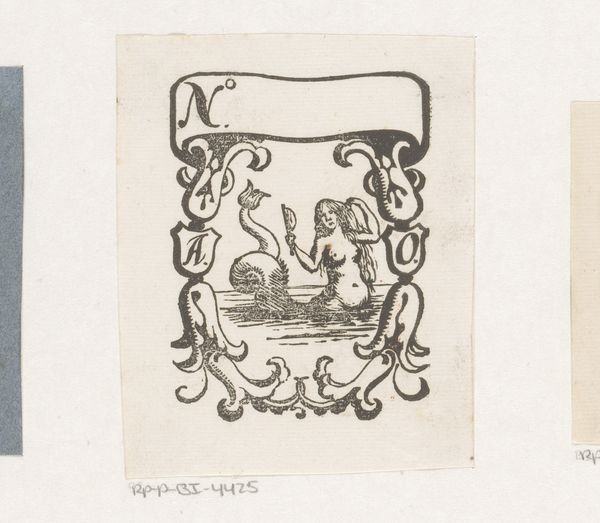
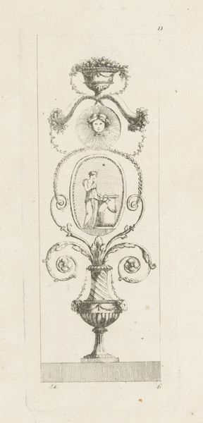
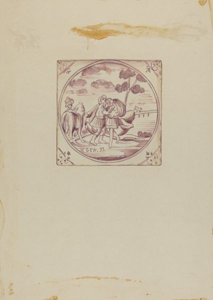
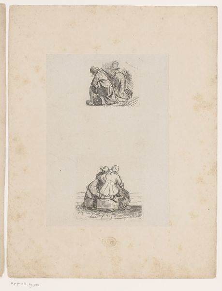
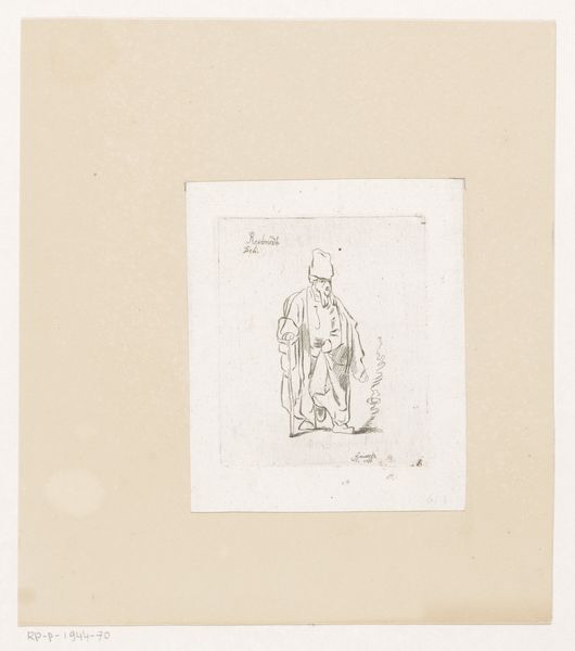
Curator: Let’s talk about this charming pen and ink drawing, "Vignet van Uitgeversmaatschappij L.J. Veen", which roughly dates from 1887 to 1916, by Willem Pothast. The Art Nouveau style immediately caught my attention. What’s your initial take? Editor: It's the labour, that constant backbreaking labor rendered in stark lines. The whole image reads as very much of the people, for the people. How much of that focus on industry do you think can be attributed to social currents at the time? Curator: Certainly, the late 19th and early 20th centuries saw increased industrialization and labor movements. Publishing houses like L.J. Veen were instrumental in disseminating new ideas. Vignettes such as these helped shape a brand's image. This one feels populist with its rendering of labor. Editor: And that frame! Those flowing Art Nouveau lines simultaneously elevate the central figure while grounding the illustration firmly in a sense of accessible design and consumption. Do you think that dualism aided the commercial interests it hoped to forward? Curator: Undeniably. Art Nouveau aimed to democratize art by integrating it into everyday objects and visual culture. By using these stylistic elements in this ink drawing, L.J. Veen hoped to cultivate the image of a forward-thinking publishing company accessible to a wider audience. Editor: So the message is as much about social appeal and approachability as it is about...production and progress itself. This drawing offers insight into not just commercial interests but social mobility as well, given the labour-intensive focus. Curator: Precisely. Pothast here wasn’t simply decorating a page but actively participating in shaping the public image of a significant cultural institution. Editor: Interesting. Thinking about materials, it makes me wonder what type of pens were commonly used during the period. The linework reminds me of sketches for mass publication. I am more engaged with the materiality of the drawing and less about the social ramifications within the public sphere. Curator: But even your material considerations reveal a deeper history; Pothast’s choice of pen and ink would dictate the kind of visual culture L.J. Veen would circulate and, in effect, impact public engagement, would you agree? Editor: Point taken. The intersection between the materials and the public messaging opens my eyes further. Curator: Mine too!
Comments
No comments
Be the first to comment and join the conversation on the ultimate creative platform.
