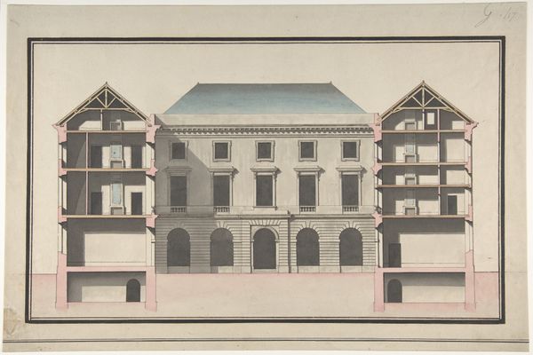
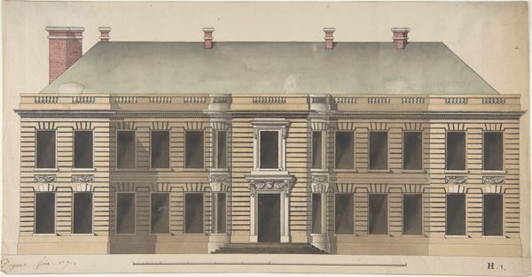
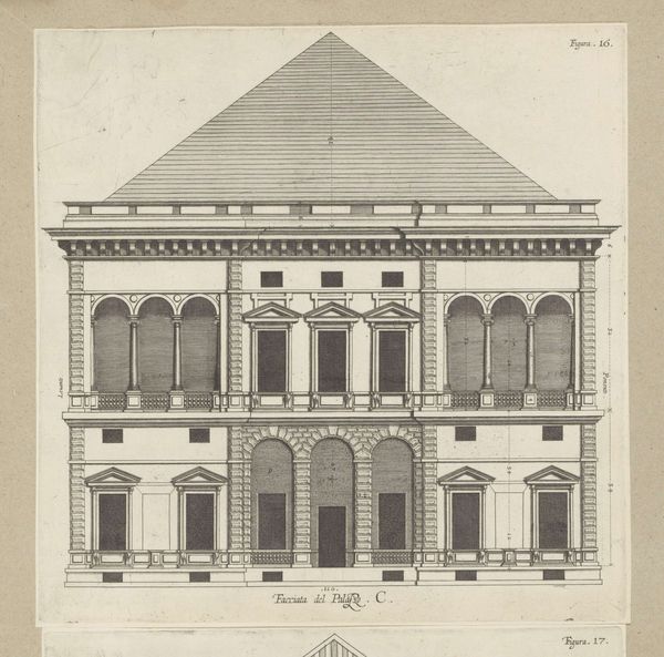
Design for the Collège de France, Paris: Elevation of the Wings of the Court with a Transverse Section through Main Front 1767 - 1777
0:00
0:00
drawing, coloured-pencil, print, architecture
#
drawing
#
coloured-pencil
#
neoclassicism
# print
#
coloured pencil
#
watercolor
#
architecture
Dimensions: 12 5/16 x 19 11/16 in. (31.2 x 50.0 cm)
Copyright: Public Domain
Editor: This is Jean-François Chalgrin's "Design for the Collège de France, Paris," an architectural elevation rendered between 1767 and 1777 in colored pencil, watercolor, and possibly print. I'm struck by the austerity of the facade contrasted with the revealing cutaway view showing the building's inner structure. What underlying themes do you see at play here? Curator: An excellent observation. What feelings arise when you consider that the structure's inner workings, its secrets so to speak, are placed right alongside its public face? How does this impact our perception of the College itself as an institution? Editor: It's as if the building is revealing both its strength and vulnerability simultaneously. There’s this rigid, neoclassical exterior but a peek inside shows raw materials and structural necessities. Almost like showing both the ideal and the reality. Curator: Precisely. Neoclassicism itself, with its emphasis on reason and order, was in part a response to the perceived excesses of the Baroque. But here, Chalgrin subtly dismantles that pristine facade by exposing the inner architecture, those “necessities” you noted. Is there an honesty implied, or perhaps a commentary on what institutions choose to reveal? Editor: I think there’s an element of truth-telling. Showing the support beams feels like admitting that even the most imposing structures need underlying support. Maybe it acknowledges human effort. Curator: And what is the cultural memory associated with classical forms, with their emphasis on symmetry, proportion, and a connection to an idealised past? Does the color palette inform how the cultural memory and meaning shift with it, using different techniques? Editor: I think the light blues and pinks soften the message. It takes away from a cold stoicism, while still nodding to the gravitas of Roman architecture. It definitely reframes neoclassicism as approachable, rather than unyielding. Curator: So, where does the enduring power of symbols lie, then? Chalgrin used his skill to combine symbols and show the dialogue between a serious imposing architectural approach with a sensitive exposure of structure, materiality, and colours. This piece feels forward thinking, to me. Editor: Me too! I never would have considered how the symbolic can reveal more when intentionally placed in dialogue with other elements. It makes you think about what society hides and what it shows.
Comments
No comments
Be the first to comment and join the conversation on the ultimate creative platform.
More like this