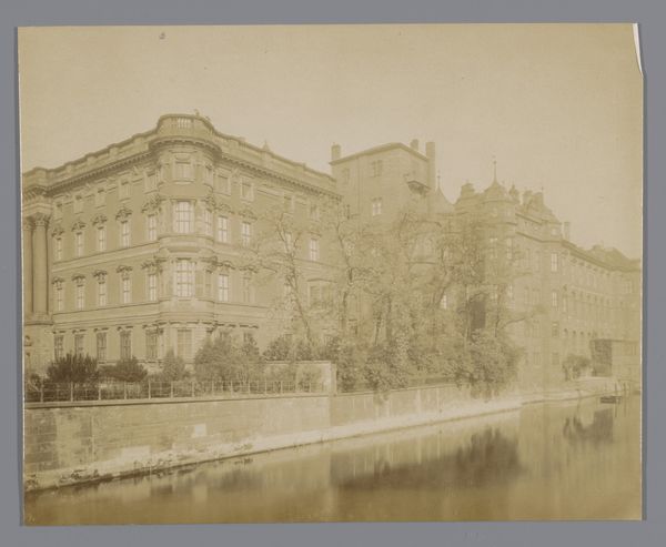
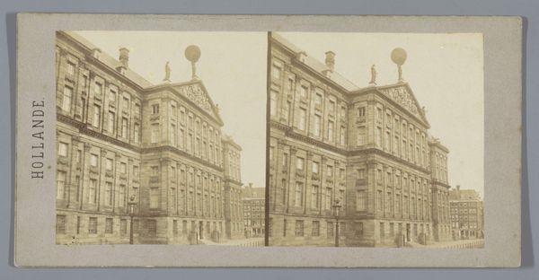
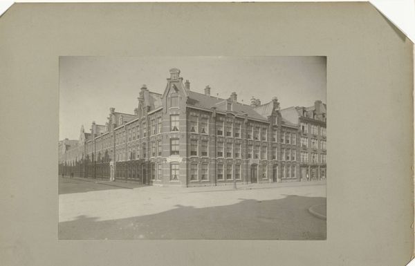
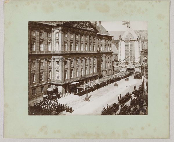
Gezicht op het administratiekantoor van de Hollandsche IJzeren Spoorweg-Maatschappij aan de Droogbak in Amsterdam 1908
0:00
0:00
#
aged paper
#
toned paper
#
parchment
#
old engraving style
#
tea stained
#
traditional architecture
#
watercolour illustration
#
watercolor
#
historical font
#
columned text
Dimensions: height 74 mm, width 114 mm
Copyright: Rijks Museum: Open Domain
Curator: This is J.J. Reynders's "Gezicht op het administratiekantoor van de Hollandsche IJzeren Spoorweg-Maatschappij aan de Droogbak in Amsterdam," from 1908. What strikes you about it? Editor: Oh, the muted tones give it a nostalgic haze, like looking through an old photograph album found in the attic. There's a quiet formality about the building and the figures in the square. A slice of life carefully preserved. Curator: Preserved through the lens of watercolor on aged paper, no less. Look at the details in the facade—the brickwork, the window treatments. It's an almost forensic level of detail considering the medium. We must also remember the materials: watercolour allows the kind of detailed portrayal within specific constraints which demands expertise. Editor: It’s beautiful, almost deceptively calm. Are these architectural renderings that masquerade as artworks, or vice versa? This delicate hand-tinting—it gives life to the whole scene. It almost makes one forget the grime of an industrialising city. Curator: Ah, but let’s not overlook the context! Amsterdam at the turn of the century was rapidly changing. This office building of the railway company isn’t just a building; it’s a symbol of progress, of industrial growth. And that beautiful facade conceals the hard labor, the material extraction and fabrication involved in creating this "progress." We are drawn to its detail but what are we ignoring by doing so. Editor: Fair enough, I'm a sucker for pretty facades. Still, Reynders captured a specific atmosphere, didn't he? It invites a daydream...I can almost hear the clip-clop of horseshoes on cobblestones. Even those carefully planted saplings somehow inspire hope for a greener, growing future. Curator: Even though Reynders likely had specific material constraints when deploying watercolour and that paper- perhaps these impacted or even enhanced this perceived aesthetic dimension, and can provide social cues or understandings for his audience in that period. Editor: So, ultimately, we're left with this lovely, quiet echo of a bustling era—a tangible artifact imbued with industrial undertones and surprising painterly delicacy. It's quite lovely to observe now. Curator: Precisely! And to appreciate how material choices and techniques are inherently linked to cultural and economic forces. It's like holding history in your hand, filtered through pigments and paper.
Comments
No comments
Be the first to comment and join the conversation on the ultimate creative platform.
More like this