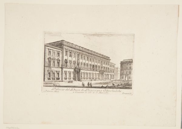
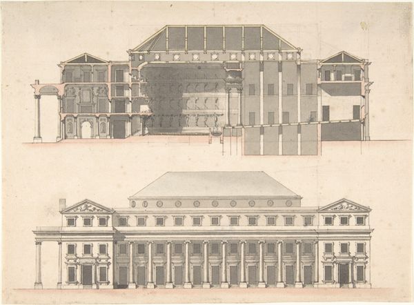
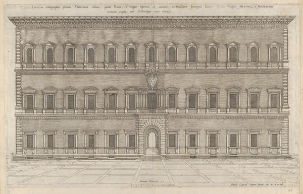
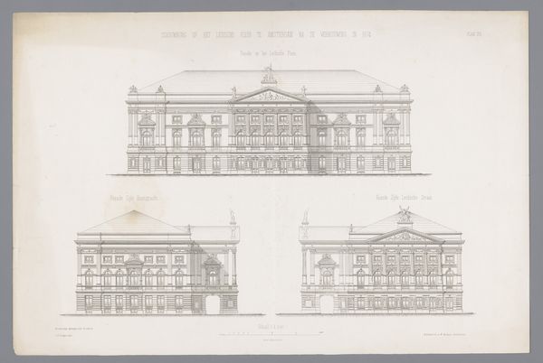
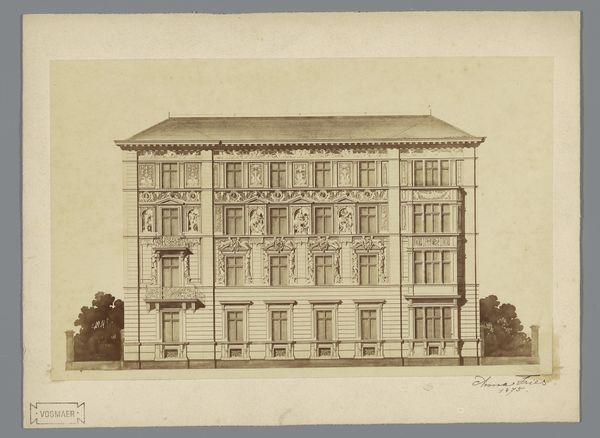
drawing, print, etching, paper, ink, graphite, pen, architecture
#
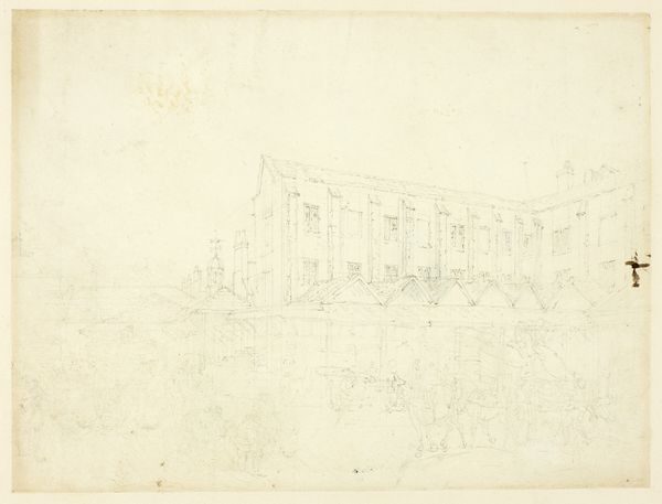
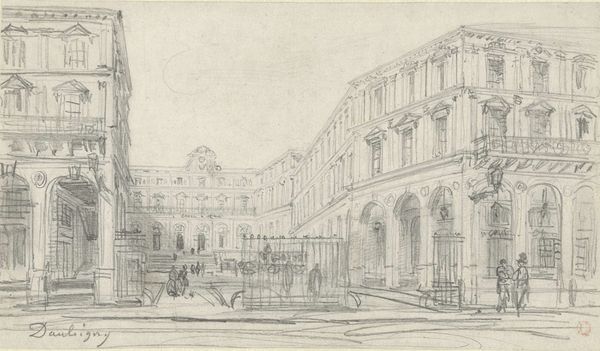
drawing
#
neoclacissism
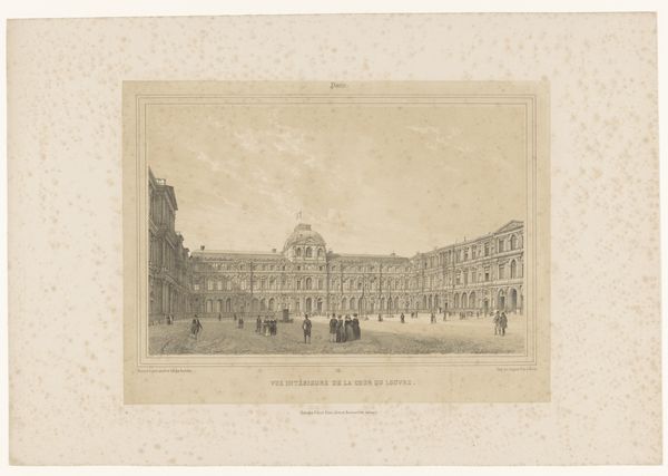
# print
#
etching
#
etching
#
paper
#
ink
#
line
#
graphite
#
pen
#
cityscape
#
architecture
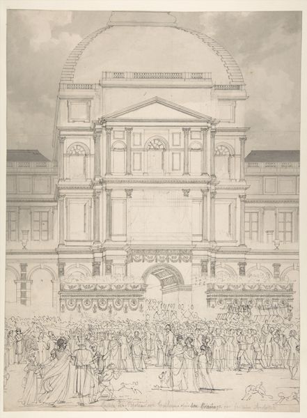
Dimensions: 257 × 411 mm
Copyright: Public Domain
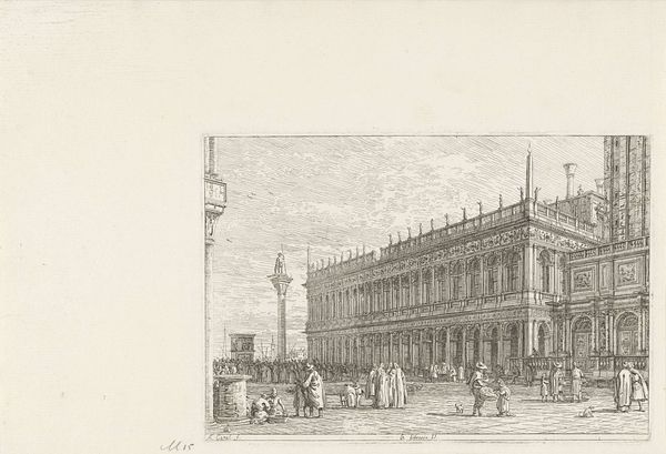
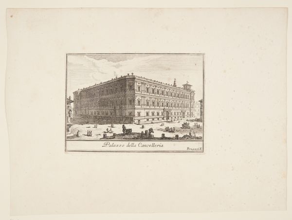
Editor: This is Victor Jean Nicolle's "The Colonnade of the Louvre," a drawing and etching made with ink, pen, and graphite on paper. The architectural details are amazing, but the monochromatic palette makes it feel almost ghostly. What formal qualities strike you? Curator: Immediately, the relentless linearity dominates my perception. Notice how Nicolle orchestrates a strict horizontal rhythm with the colonnade itself, countered by the vertical emphasis of the individual columns. This juxtaposition creates a dynamic tension within an otherwise rigidly structured composition. Editor: It does create an interesting rhythm! How does the etching technique contribute to the overall effect? Curator: The etching, with its delicate lines, produces a sense of ethereal lightness. Observe how the artist uses hatching and cross-hatching to suggest depth and volume, yet the lines remain distinctly visible, refusing to fully blend and create a seamless illusion. It emphasizes the constructed nature of the image itself. Editor: So, the process reinforces the artifice, the constructedness of the scene rather than just representing it? Curator: Precisely. And consider the role of light and shadow. Notice how subtly Nicolle modulates the tones to articulate the architectural forms. It's less about dramatic chiaroscuro and more about a nuanced rendering of surface textures, drawing our attention to the materiality of the building and, indeed, the print itself. Editor: I hadn’t considered the subtle shading before. Looking closer, I can really appreciate how those minute tonal shifts bring the structure to life, while maintaining the line quality. Curator: Indeed. And by focusing on the internal relationships of line, tone, and form, we arrive at a richer understanding of the artist's formal intentions. It moves beyond simple representation. Editor: It’s amazing how much you can see just by focusing on those formal elements! I'll definitely look at art differently from now on. Curator: I'm glad to have shared this method with you. Paying attention to material and compositional qualities yields rewarding interpretations.
Comments
No comments
Be the first to comment and join the conversation on the ultimate creative platform.
More like this