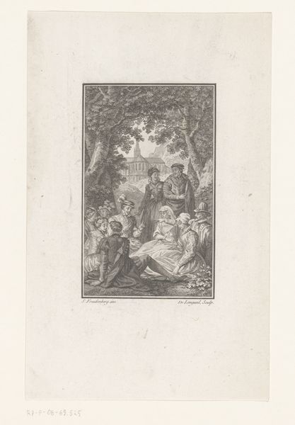
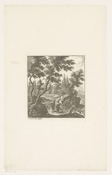
print, engraving
#
baroque
# print
#
figuration
#
history-painting
#
engraving
Dimensions: height 162 mm, width 107 mm
Copyright: Rijks Museum: Open Domain
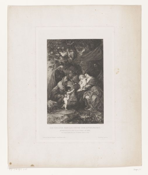
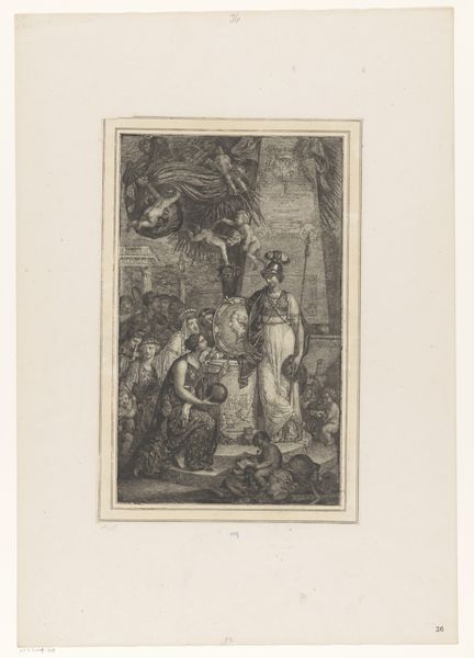
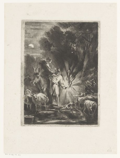
Editor: Here we have “Paus en prelaten rond een duivelse prediker,” made in 1706 by Monogrammist DT, it’s an engraving. It strikes me as very chaotic. The figures are densely packed, and there's a real sense of dramatic tension. What compositional elements do you find most compelling? Curator: Observe the stark contrast achieved through the engraving technique. The artist masterfully uses light and shadow to guide the eye. The composition is bisected into distinct spatial registers. Consider the intricate lines, each precisely placed to delineate form and create texture. Editor: The background seems to fade into a blur. Is that intended to emphasize the foreground figures? Curator: Precisely. The artist establishes a clear hierarchy. Notice how the lines become finer and less distinct in the background, creating a sense of depth while drawing our attention to the central figures, in particular the implied circle around the prediker. What philosophical concept may underpin this? Editor: The circle creates unity. The artist prioritized these elements over, say, political commentary. I hadn't considered it so deliberately constructed. Curator: Art is always constructed. This work exemplifies a certain commitment to Baroque aesthetics of dynamism tempered with representational precision. How else do you see the piece using its medium to enhance that aesthetic? Editor: The medium seems critical to communicating what’s in focus. The engraving and depth, allow the work to become focused only on what matters. Curator: It also seems to me that it could invite philosophical enquiry into structure as an embodiment of that period. Thank you for offering your interesting questions!
Comments
No comments
Be the first to comment and join the conversation on the ultimate creative platform.
More like this